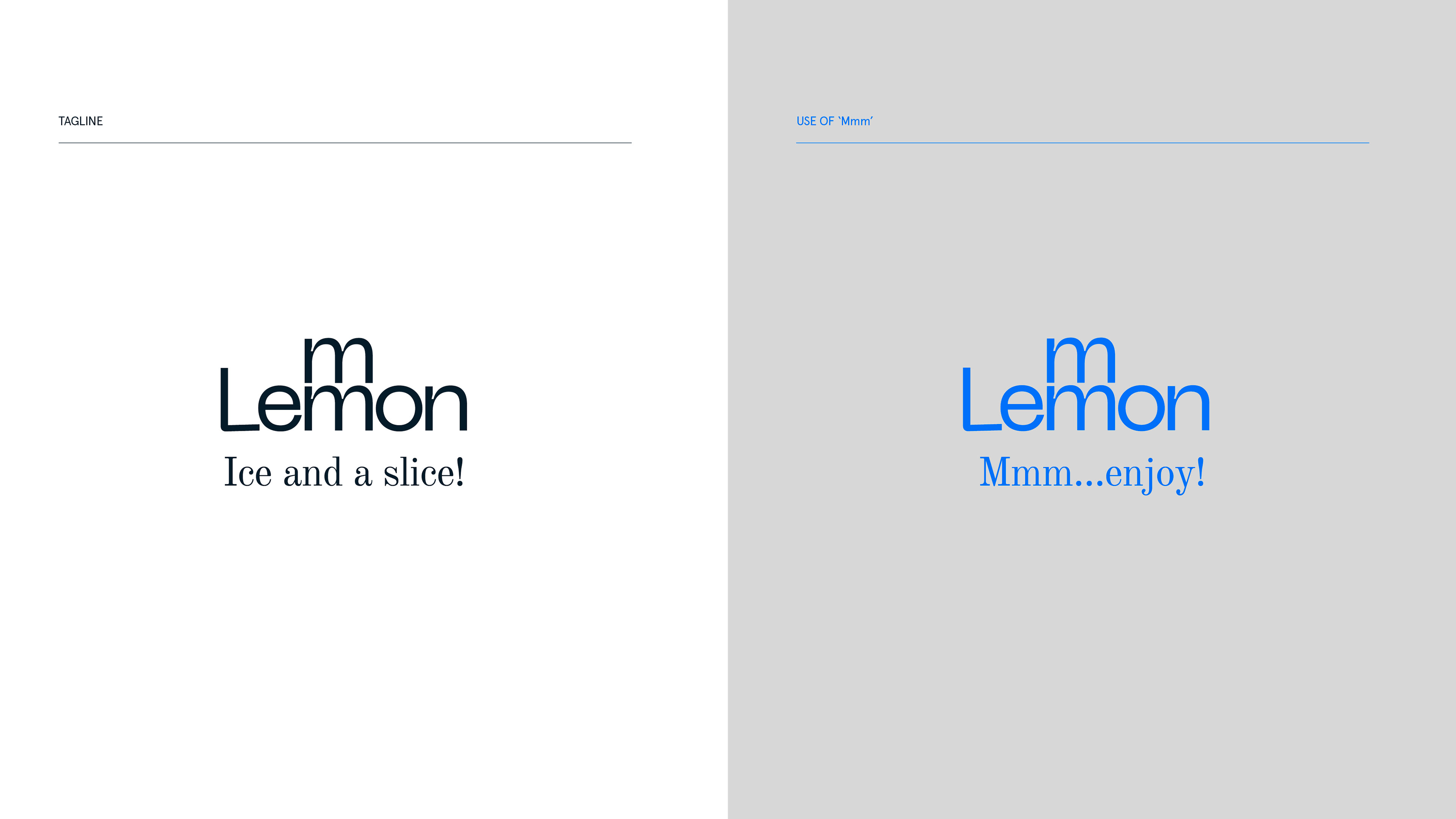
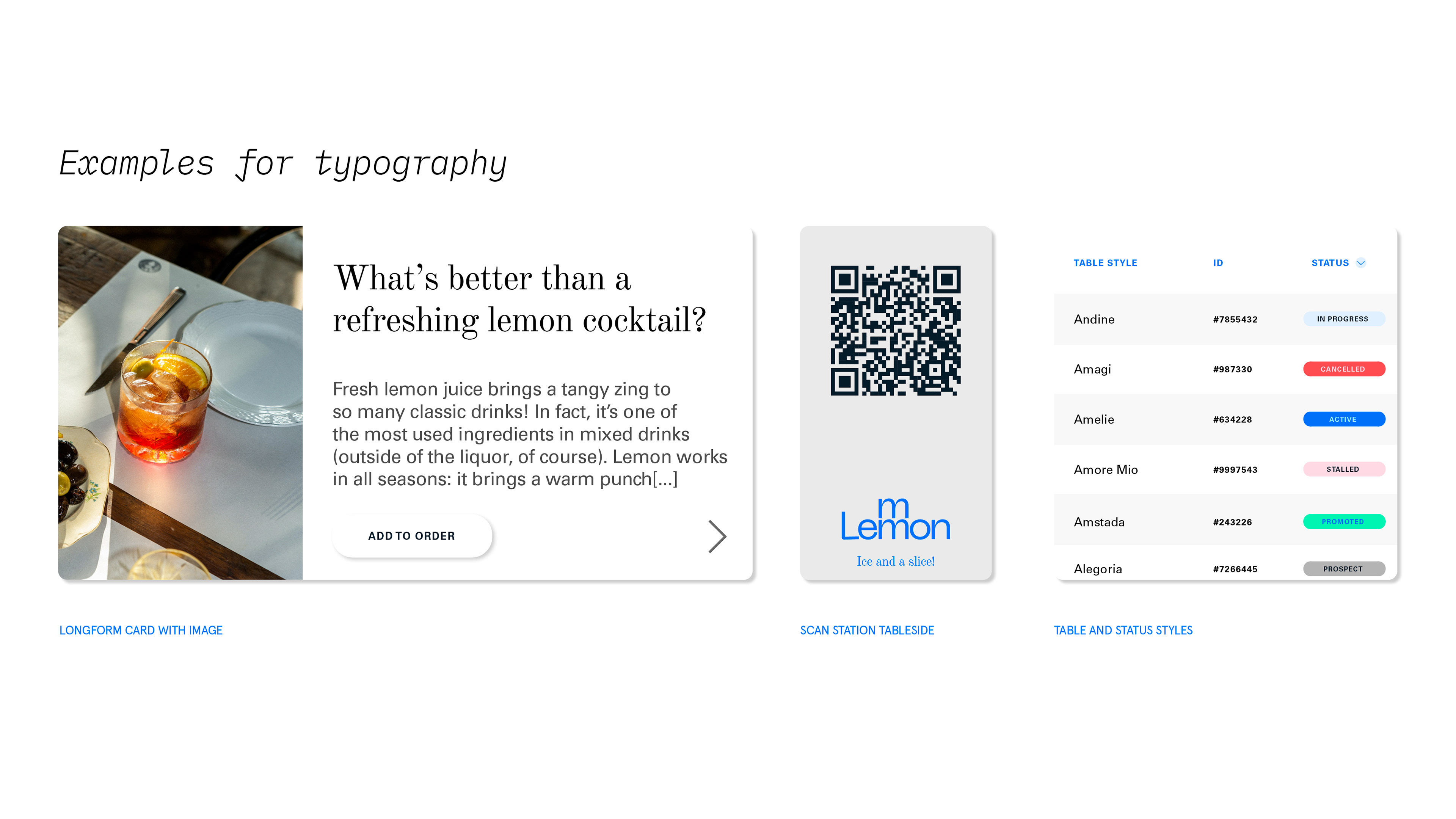
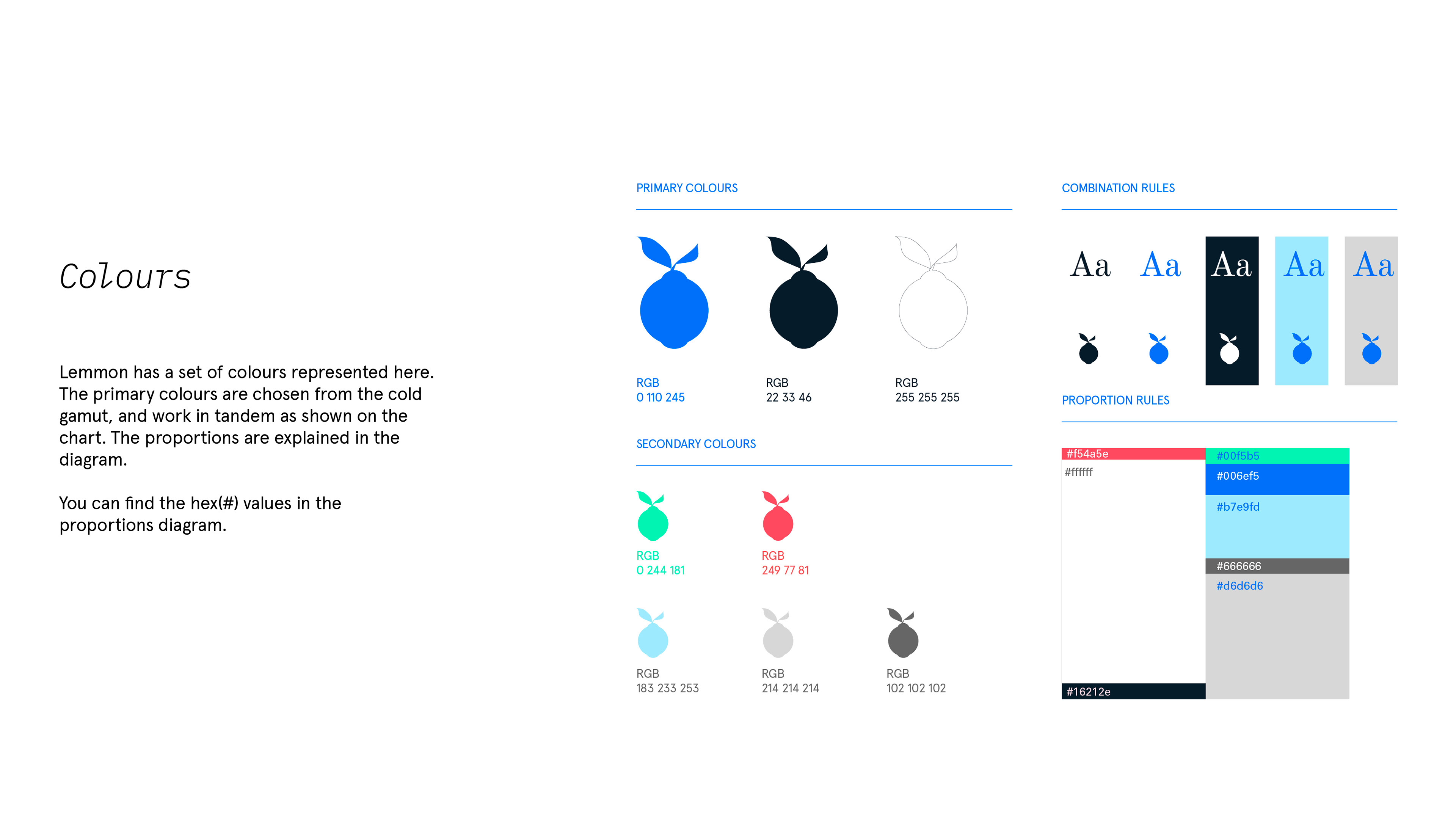
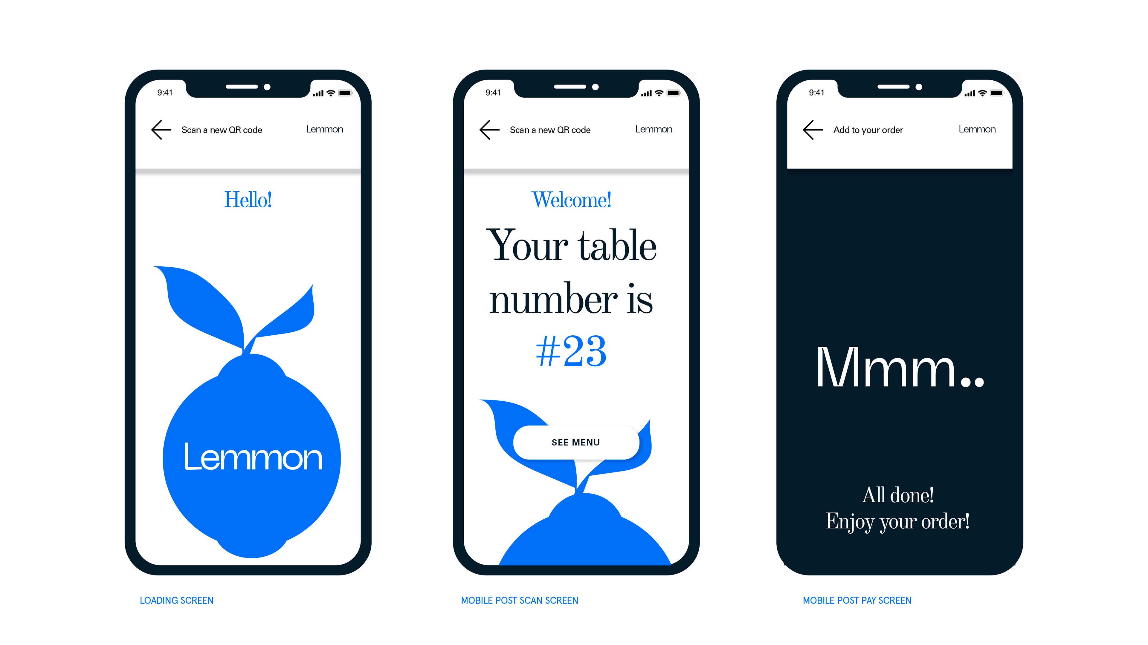
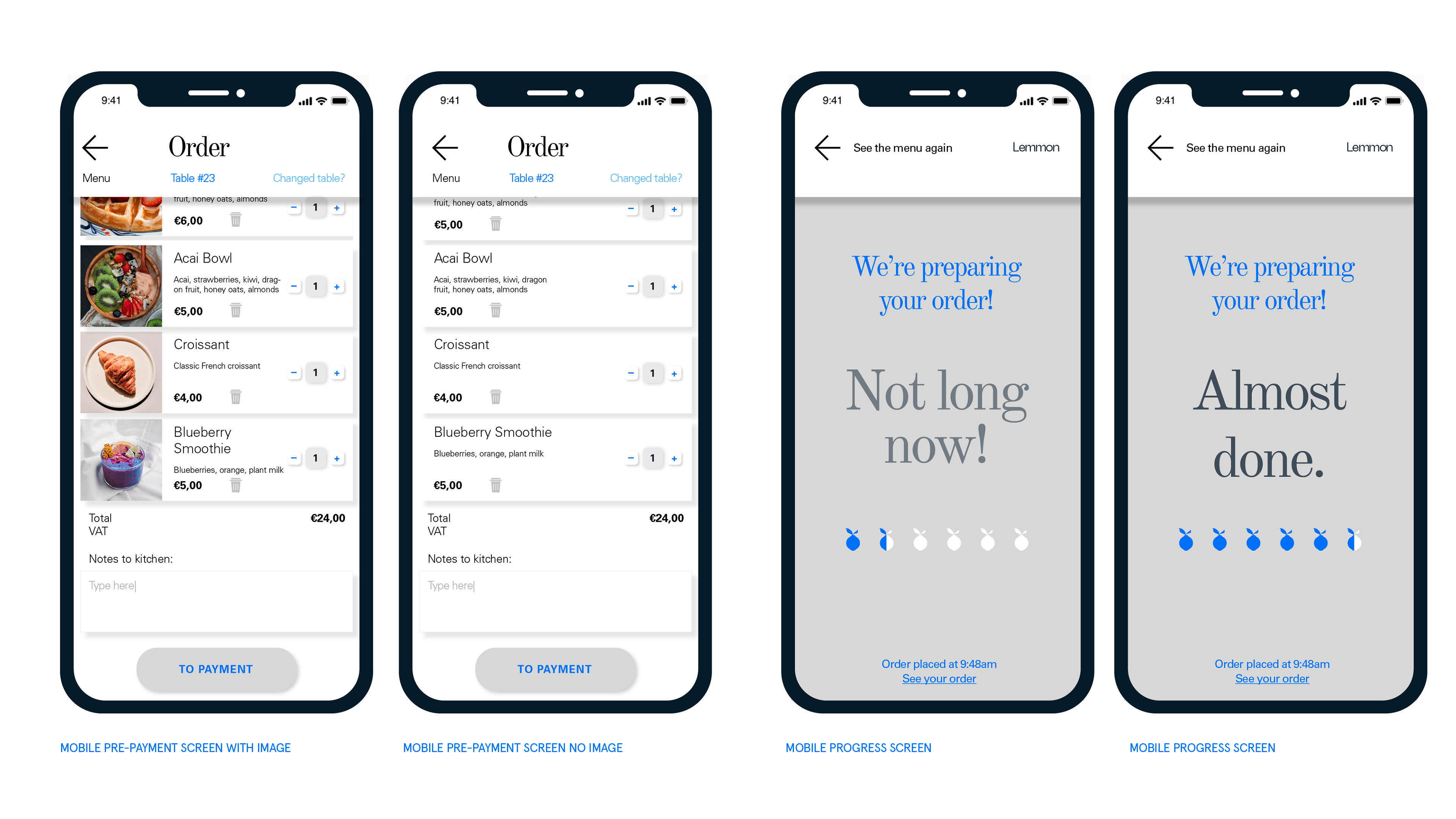
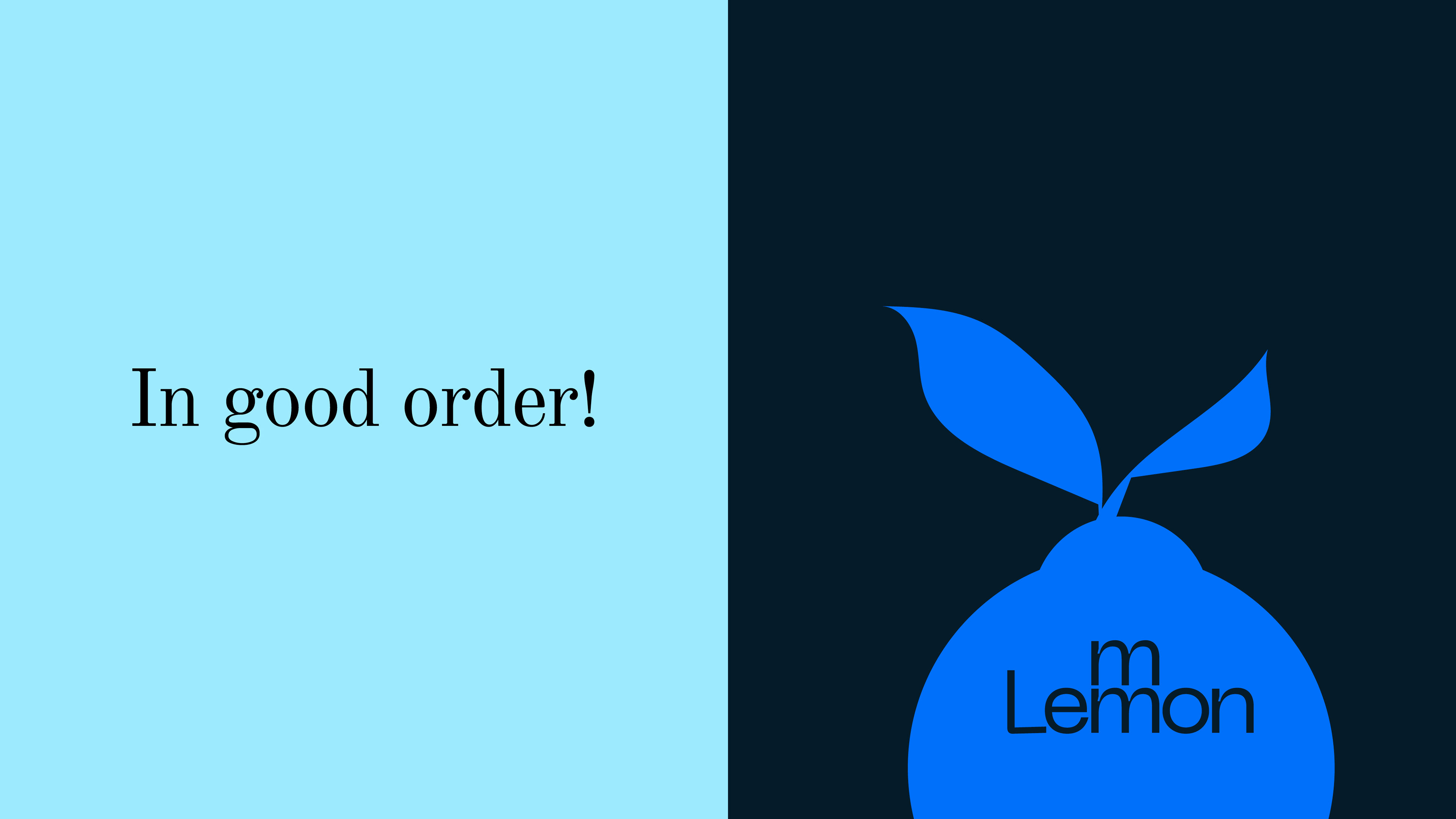
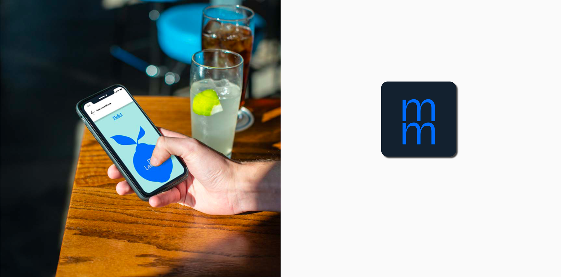
Lemmon is a web app designed to ease the process of table-side ordering. It uses QR codes to scan table numbers and bring up restaurant or bar menus. Customers can order and pay through the app, and simply wait for their food or drink to be delivered. Today, this is a familiar system, after all the distancing measures of the pandemic, but in parts of Switzerland this is still being implemented.
Ana, the founder of Lemmon, wanted to make life easier for restaurant staff and for customers. She set out to build an app that is simple, useful, fun to use but most importantly works across many types of bars, cafes and venues, as the Swiss love an outdoor terrace or kiosk bar. She came to me with an open brief, so I started looking for clues and visual references. One of the concepts was the idea of efficient use of space, which bars and restaurants are so good at. So the stackable glassware made sense. From there I created stackable typography, using the letters within the name.
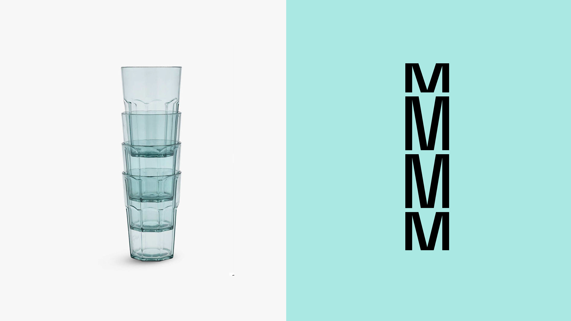
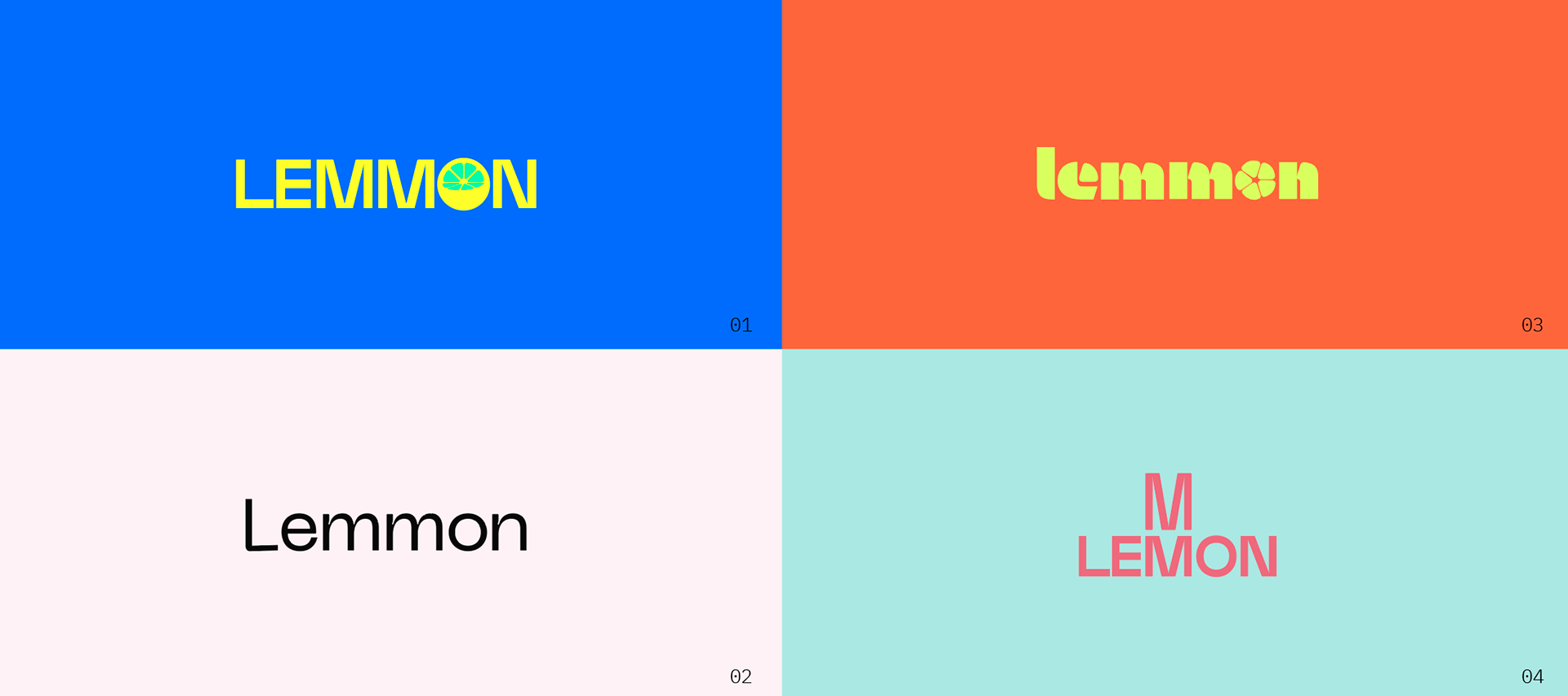
Process and iterations of the logotype: Creating four concepts initially, derived from the brand story and values.

Concept development: all four concepts with look and feel examples were explored further to define a clear direction for the final brand identity.