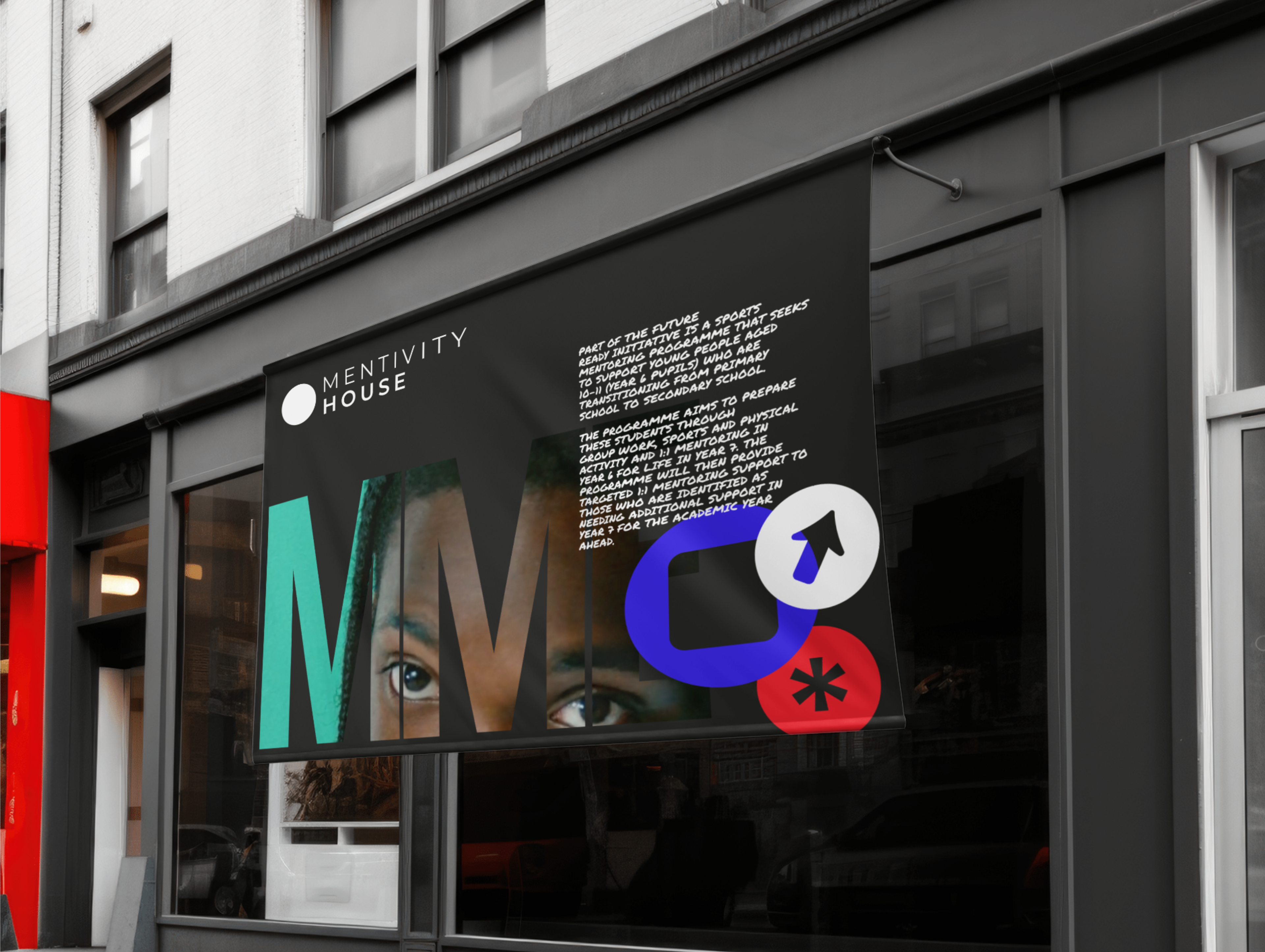
Mentivity House
Visual Identity, Brand Architecture
Brand: Mentivity
Founder: Sayce Holmes-Lewis
Sector: Youth Mentoring & Education
Services: Visual Identity • Naming • Brand Architecture
Awarded by: Community Impact Club
Overview
Mentivity is an inspirational mentoring organisation supporting young people, families, and schools through mentoring and alternative education. They deliver 1:1 and group mentoring, conversation-based learning, gender-specific mentoring, and physical education and sports coaching. Their mission is to empower young people by improving educational engagement, personal responsibility, and social mobility.
Having already impacted over 25,000 children and worked with more than 75 schools, Mentivity was entering a new stage of growth. With a new community hub opening in the regenerated Aylesbury Estate in Walworth and growing partnerships (including a collaboration with Spotify) the organisation needed a refreshed brand that reflected its expanding reach, credibility, and ambition.


The Brief
Mentivity and Creative Impact Club approached me to design a brand toolkit that would help the organisation:
Clarify their offering and communicate an expanded programme portfolio
Create a cohesive visual identity for their new location and digital platforms
Develop a flexible system adaptable across partnerships, campaigns, and youth-facing materials.
The brand needed to feel authentic and grassroots, while also professional and partner-ready, capable of speaking to both local communities and corporate stakeholders.
Approach
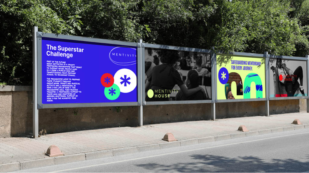
I began by revisiting Mentivity’s founding purpose: reclaiming community space and challenging flawed systems to create better pathways for young people. This inspired the central brand concept of “Reclaiming Space” which was paired with the expressive execution of overlaid posters and announcements in the local area and school markers.
The rebrand balanced Mentivity’s deep community roots with its growing influence. Drawing inspiration from urban culture, education, and art, I introduced the Basquiat crown as a core symbol, a nod to self-worth, creativity, and empowerment.
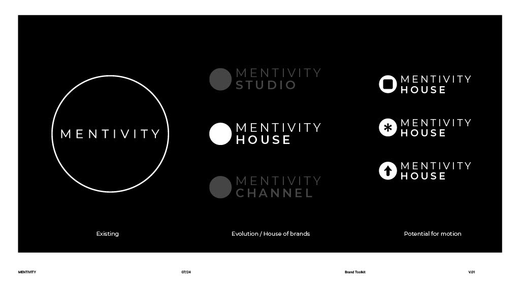
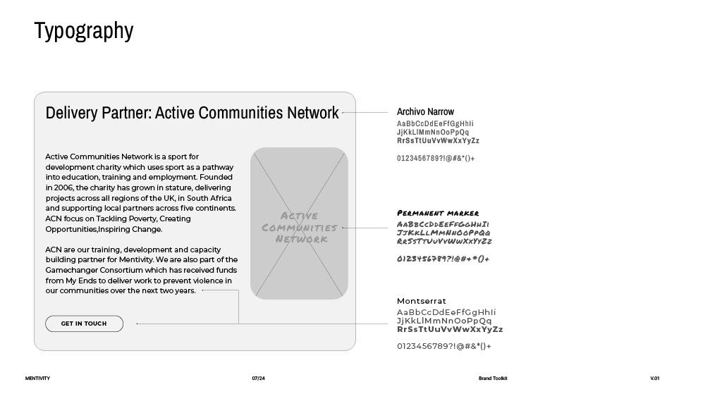
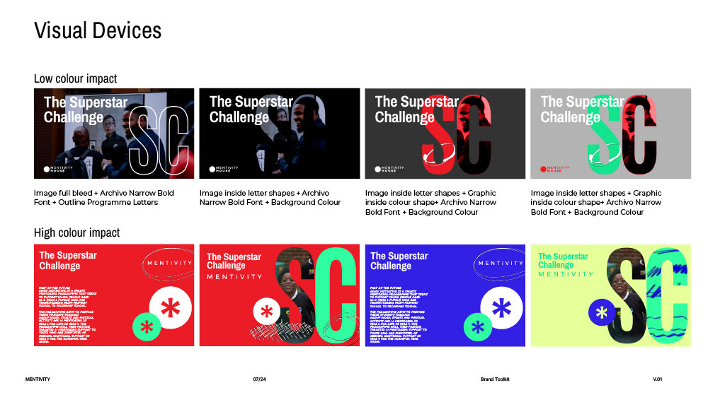
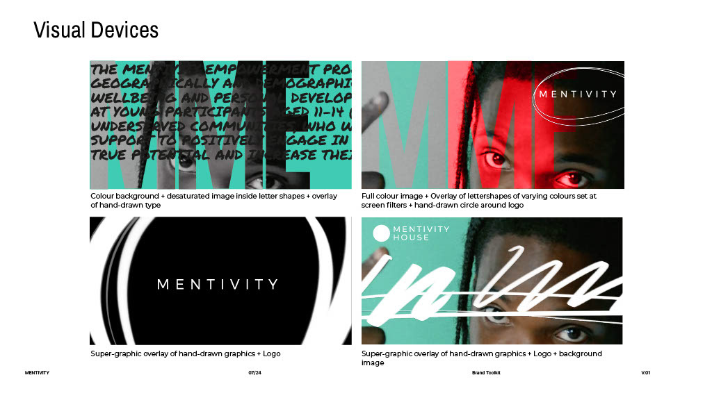
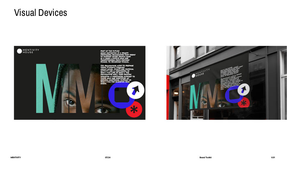
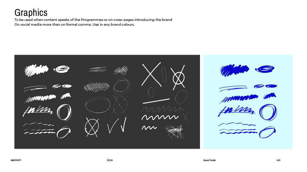
The resulting brand system combined bold typography, dynamic colours, and hand-drawn graphics to capture both energy and authenticity. A structured yet playful design language allowed flexibility across sub-programmes such as Mentivity House, Mentivity Channel and Mentivity Studio.
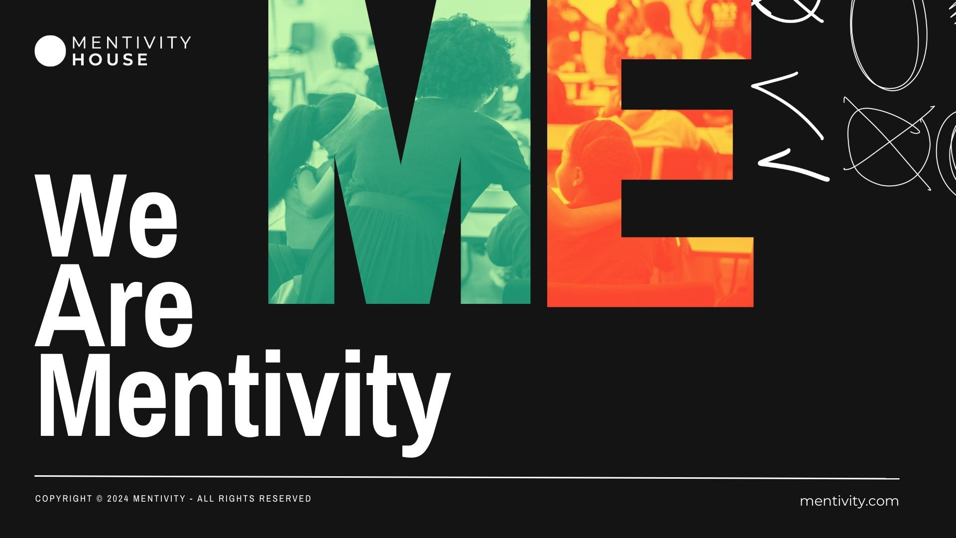
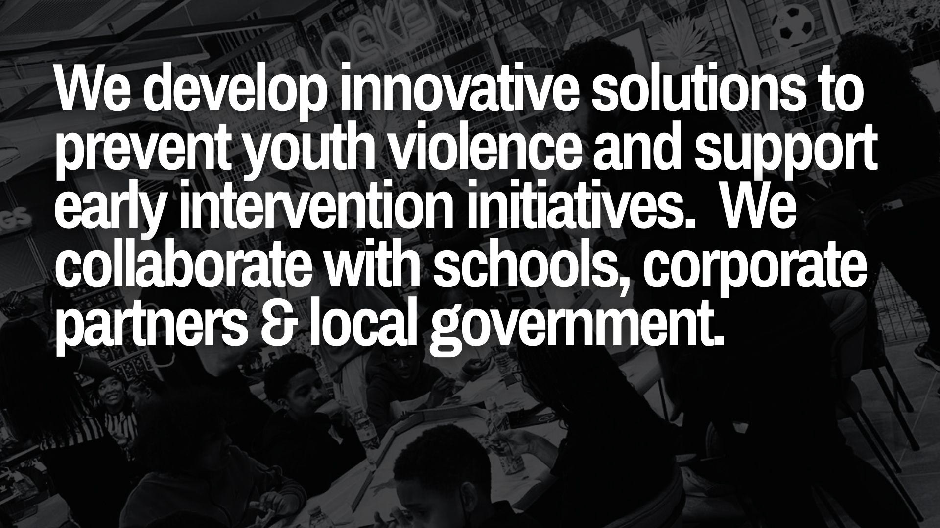
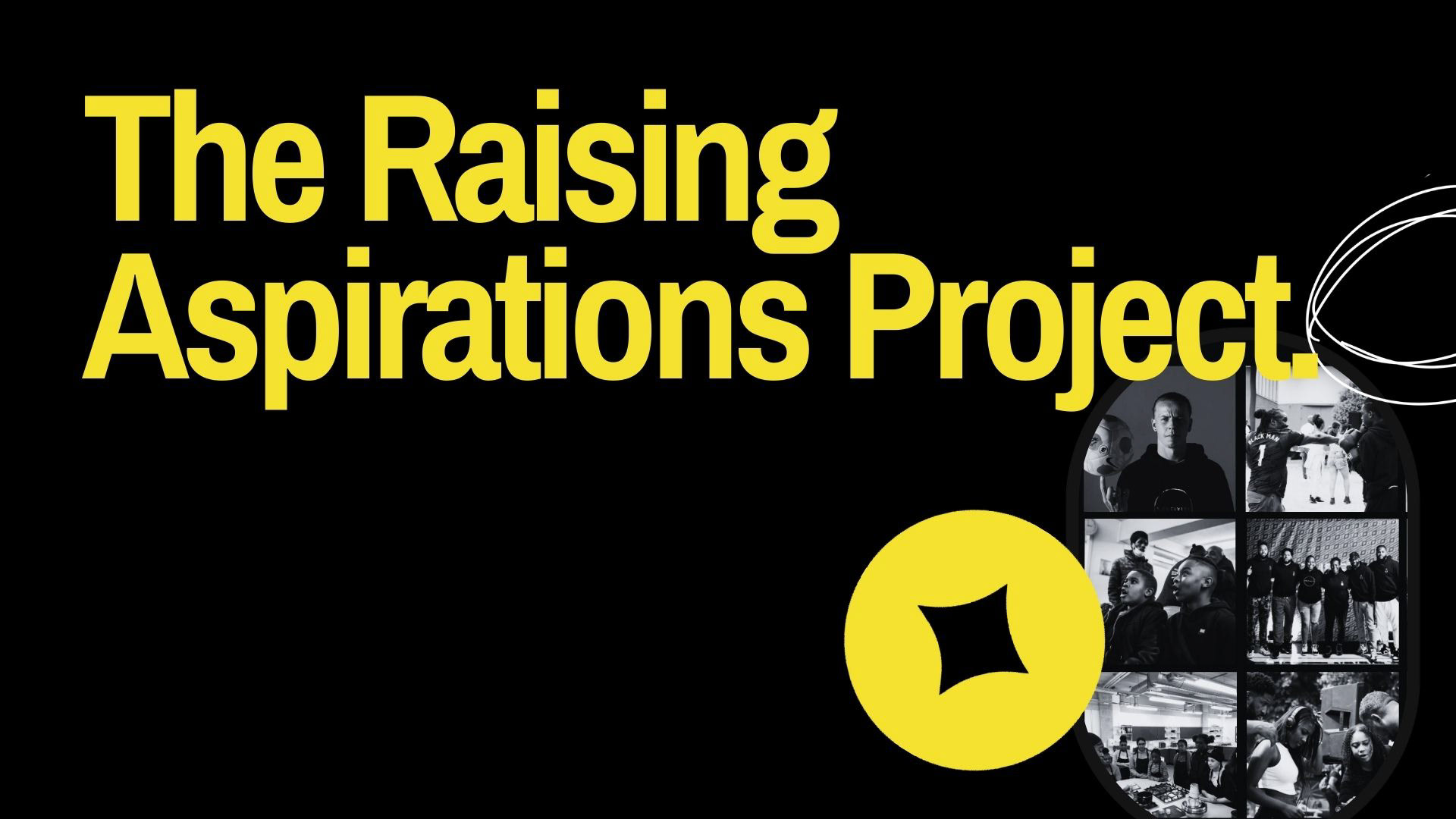
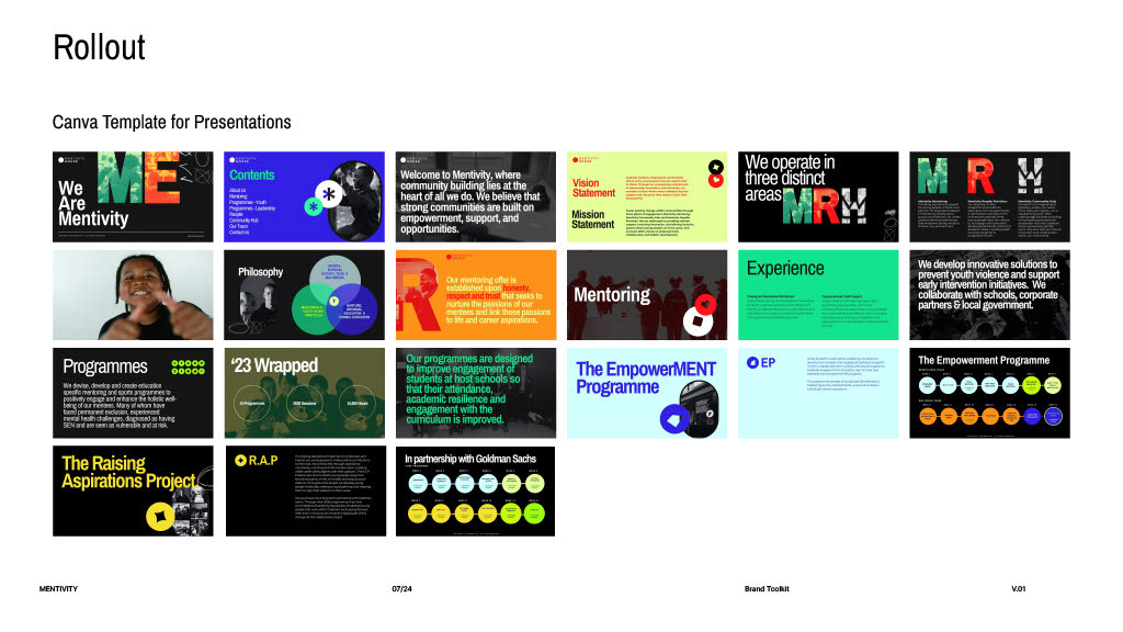
Example Presentation Deck
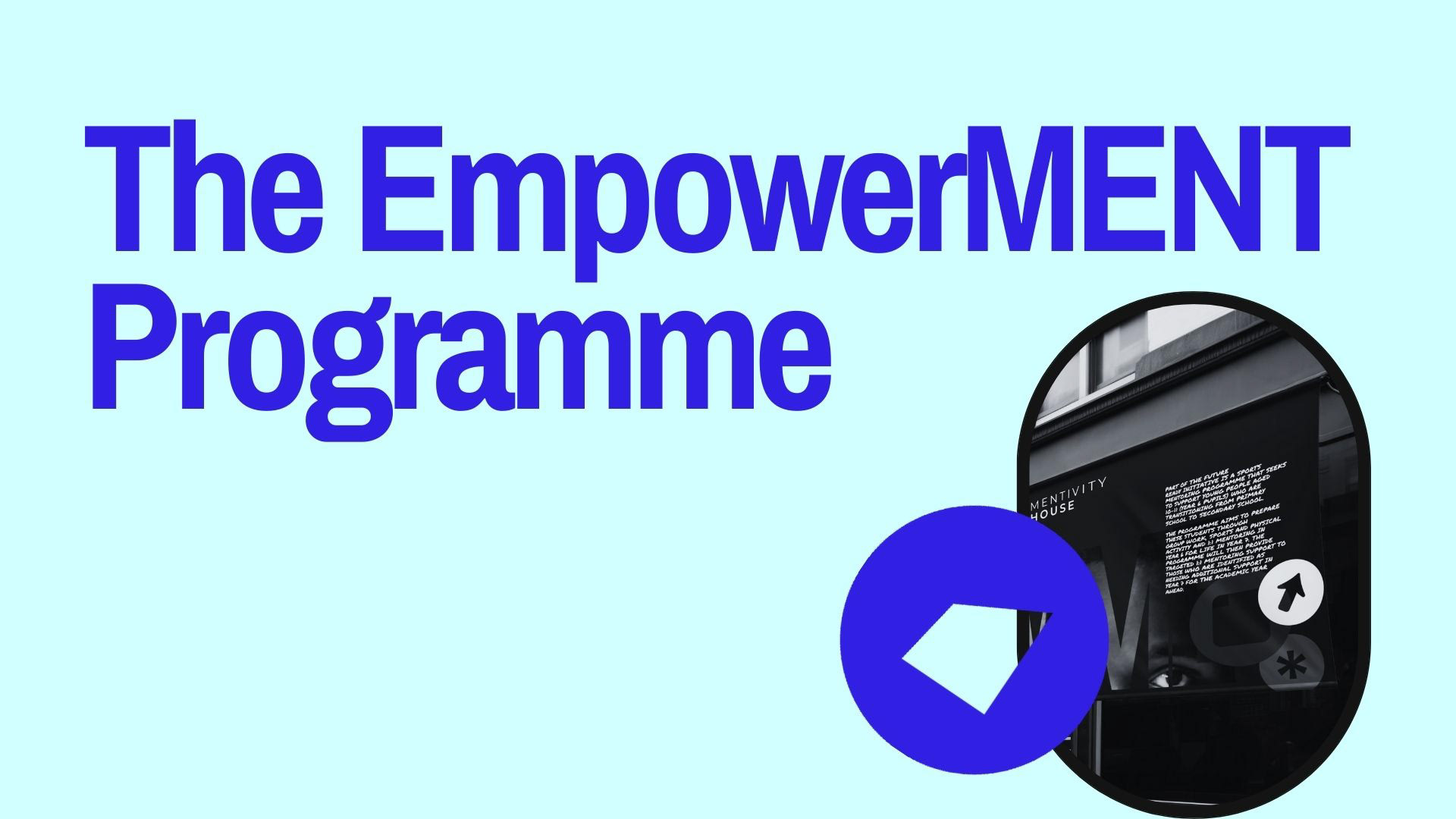

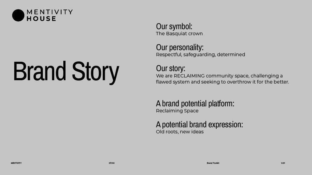
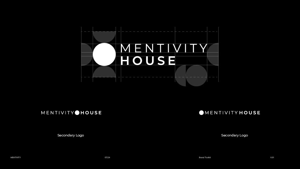
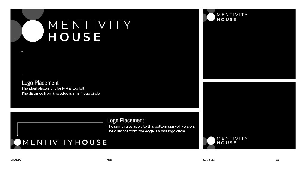
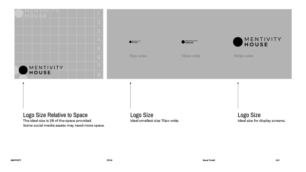
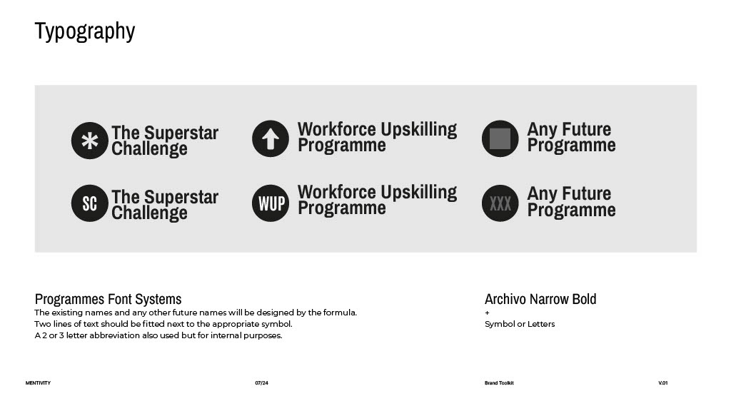
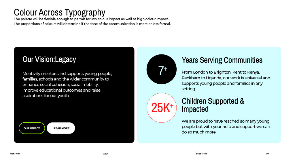
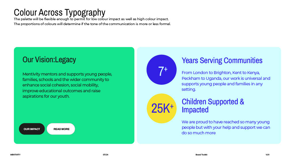
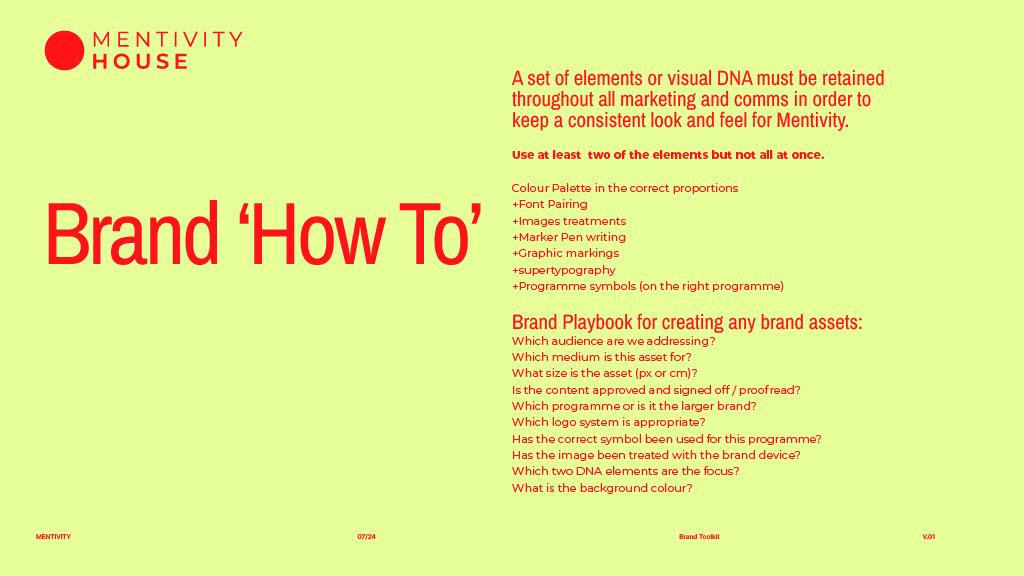
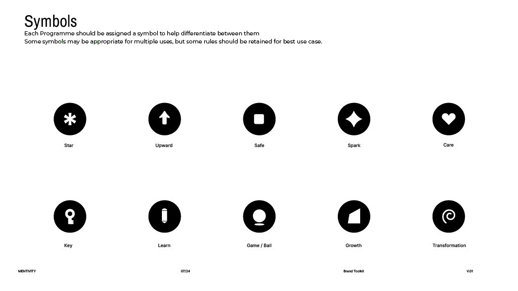
Full Brand Toolkit with 'Brand How To' Guidelines



Deliverables
Naming System for programmes and initiatives
Brand Concept & Story rooted in “Reclaiming Space”
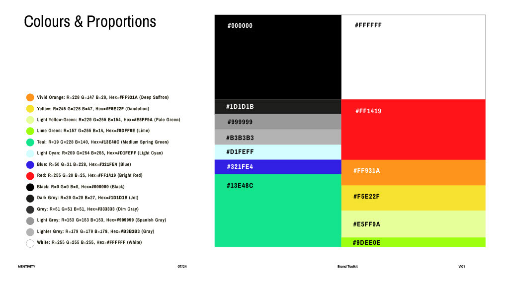
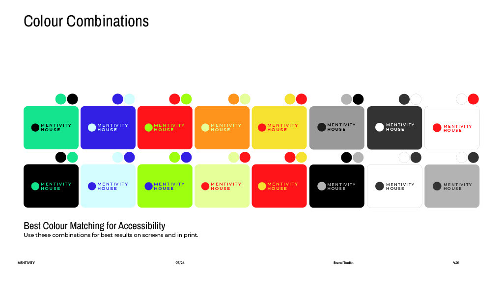
Full Visual Identity including colour palette, typography, and logo architecture
Brand Guidelines outlining tone, proportions, and accessibility standards
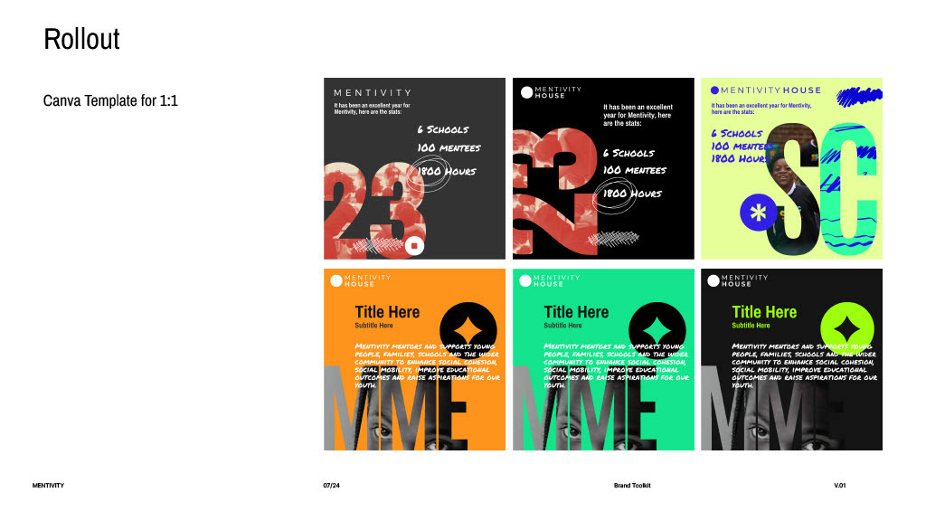
Social Media Toolkit for ongoing content creation
Presentation Deck Templates for funding, partnerships, and outreach
Outcome
The new brand enabled Mentivity to present itself as both community-led and professional, helping strengthen relationships with funders, schools, and brand partners. The visual identity gave the team confidence and cohesion as they launched their new hub, delivered cross-regional mentoring programmes, and built visibility with major partners.
The brand toolkit also provided Mentivity with autonomy allowing their in-house team to adapt materials using accessible tools like Canva while maintaining consistency and impact.
