tw:g
Visual Identity, Art Direction
Brand: Twig, Bioengineering
Sector: Tech-For-Good
Services: Visual Identity • Brand Concept • Explainer Video • Molecule Design • AI Creative Direction
Agency Partner: Cohesion Labs
Overview
Twig is a bioengineering company using AI to reengineer some of the world’s most pervasive ingredients, aiming to replace harmful industrial production practices with more sustainable alternatives. Their mission blends cutting-edge science with environmental responsibility: creating a future where essential products are manufactured without environmental destruction or reliance on petrochemicals.
Because their field touches on heavy issues like pollution, unsustainable agriculture, ecological harm twig needed a brand that would pivot perception: from fear or scepticism to optimism, accessibility and scientific possibility. The brand had to reflect both the seriousness of their mission and their confidence and mission to make bioengineering better.
The Brief
Create a brand identity and web presence that:
Communicates twig’s complex, science-forward mission in a clear, inviting, human-centred way
Makes bioengineering feel accessible and optimistic rather than alienating
Provides a flexible toolkit for future growth, outreach, investor relations, and content scaling
Integrates brand expression, tone of voice, motion design and UI/UX all aligned with their scientific vision and youthful ambition
In short: give twig a personality and presence that matches their work and helps bring their mission to a broader audience.
Approach
Working within Cohesion Labs as the sole art-director and designer, I led the visual and experiential translation of twig’s identity. My approach rested on a few core principles:
1. From scientific rigour to human optimism
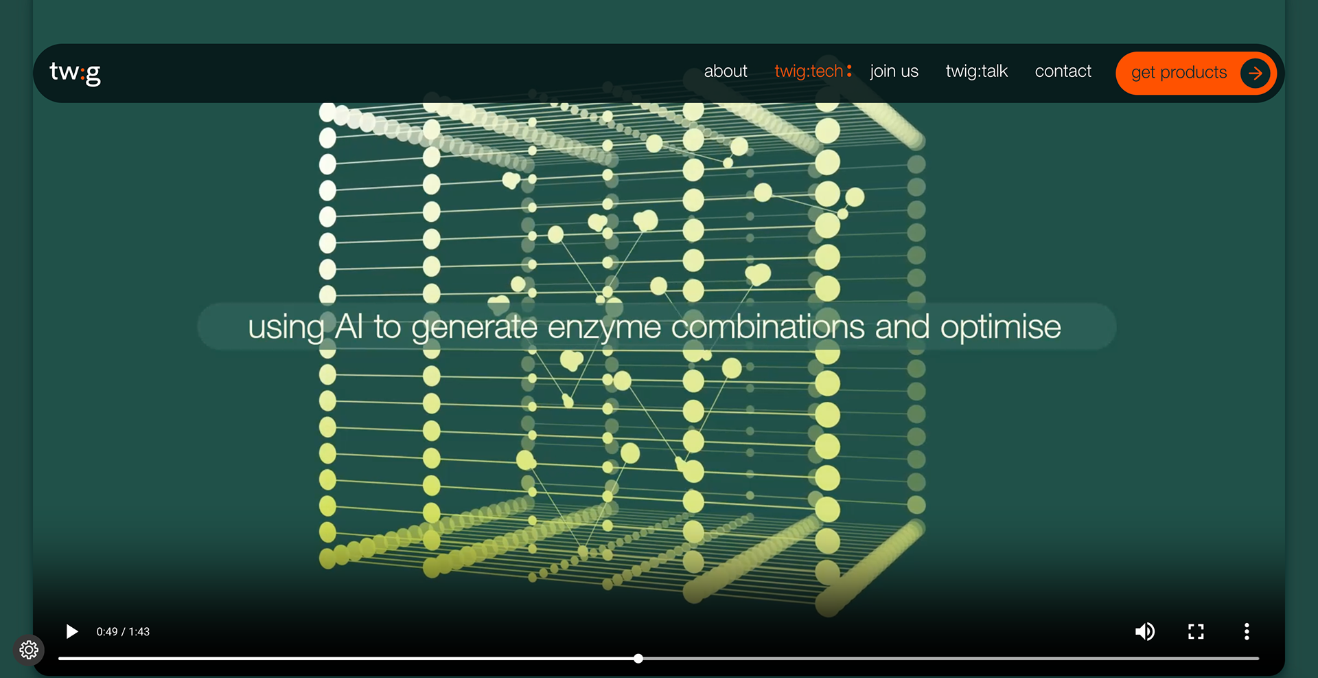
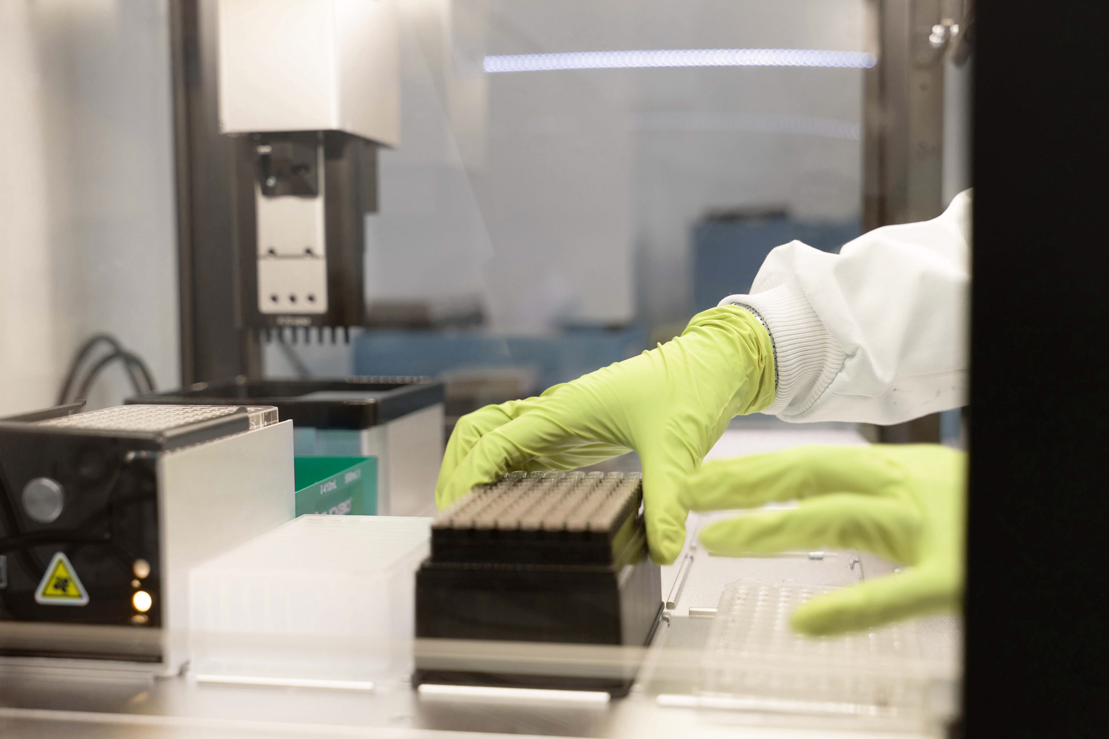
We started by mapping twig’s AI-driven bio-engineering process, exploring how their internal systems and language communicated innovation. Instead of hiding this technical side, we embraced it reframing it in a way that invites engagement. The idea was to humanise science without diluting credibility.
2. A symbolic identity anchored in possibility
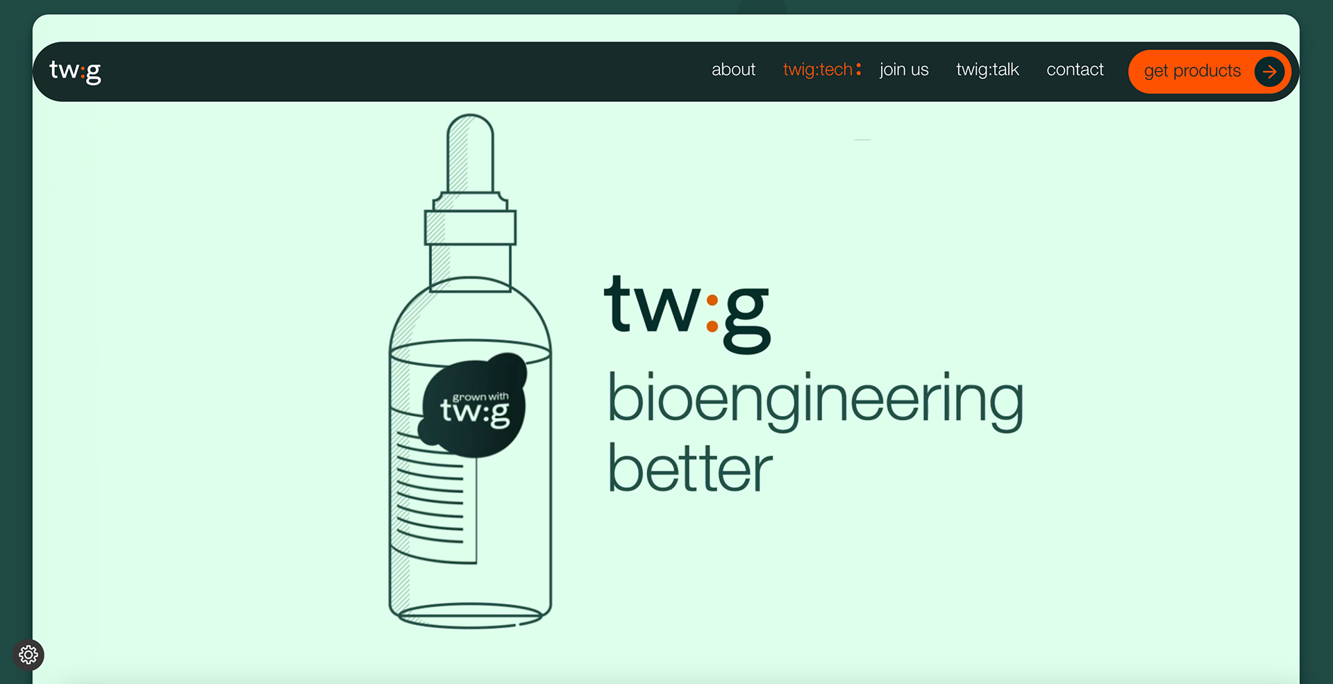
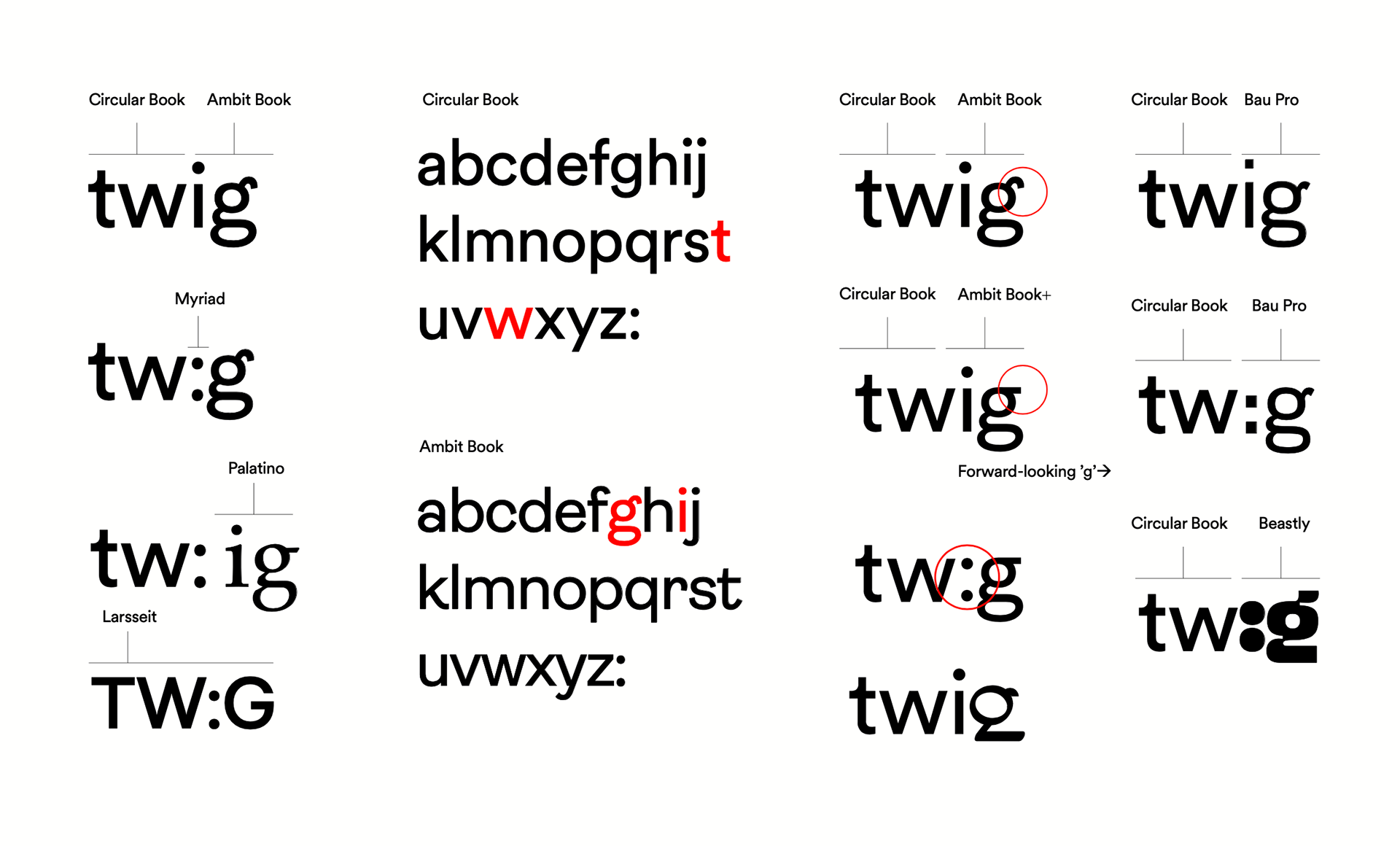
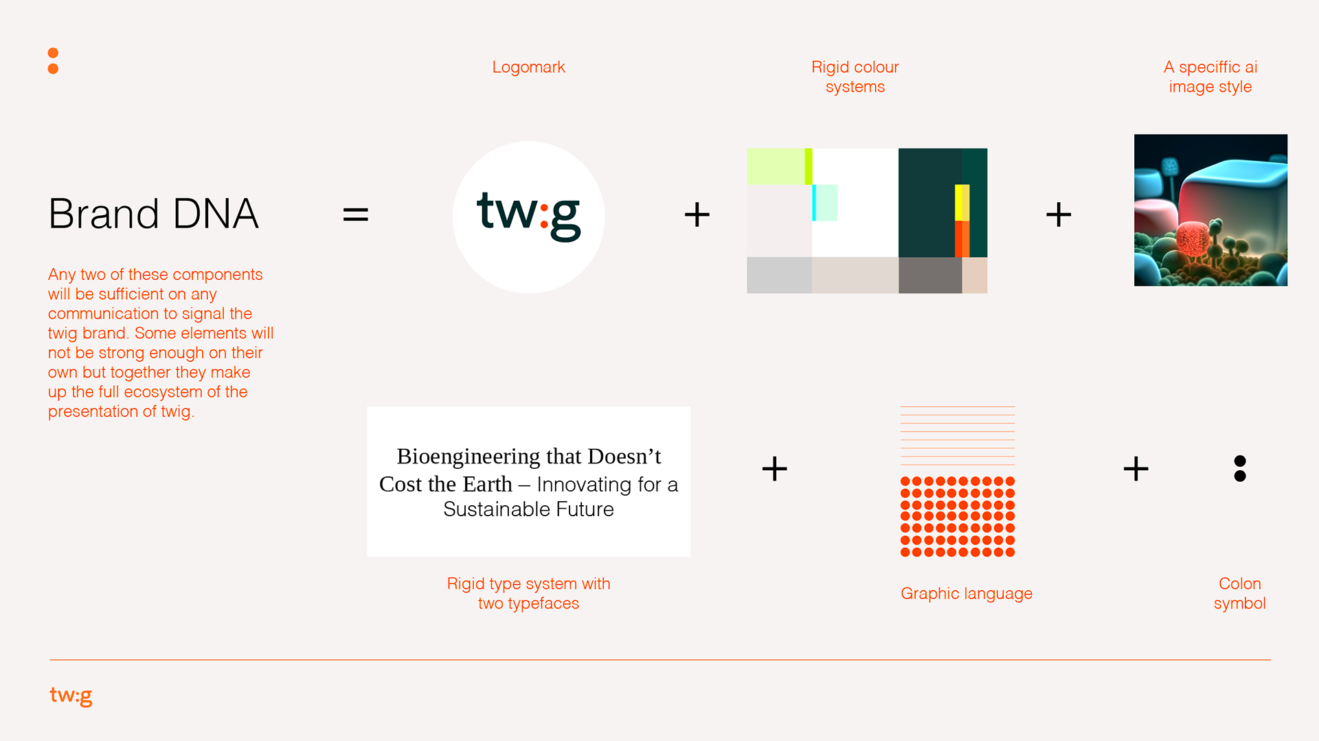
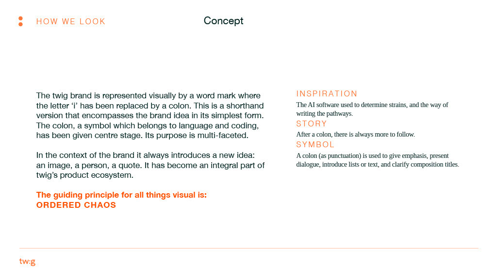
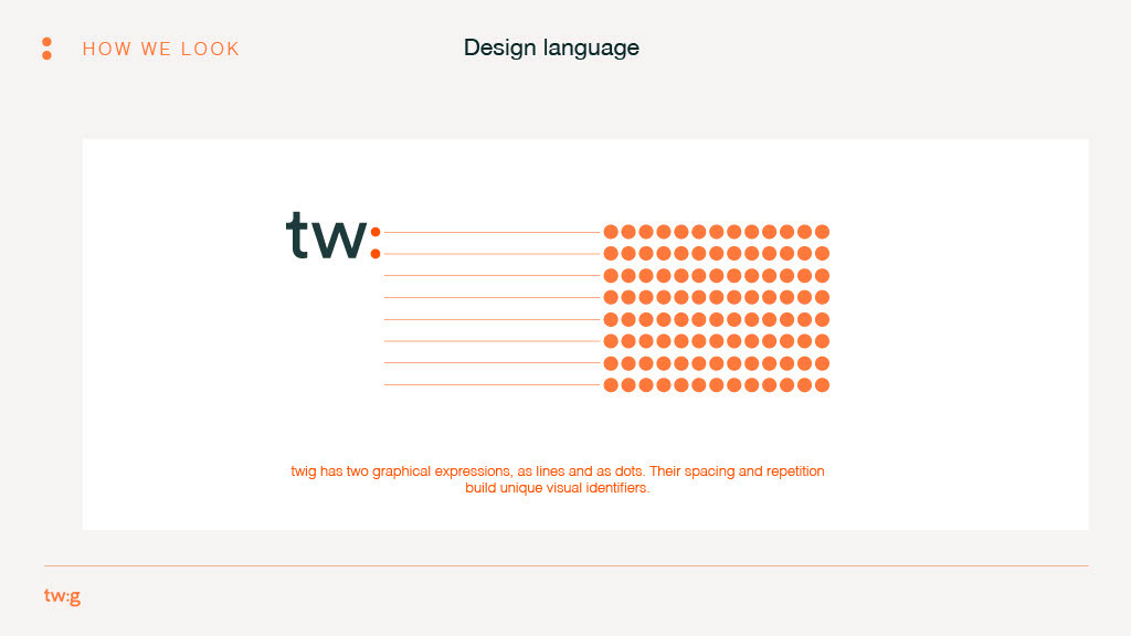
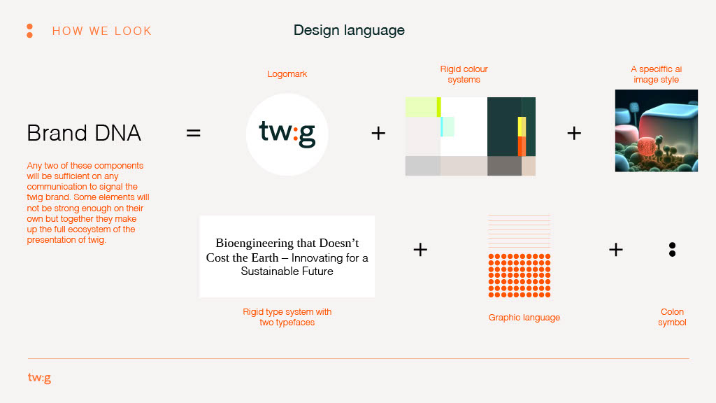
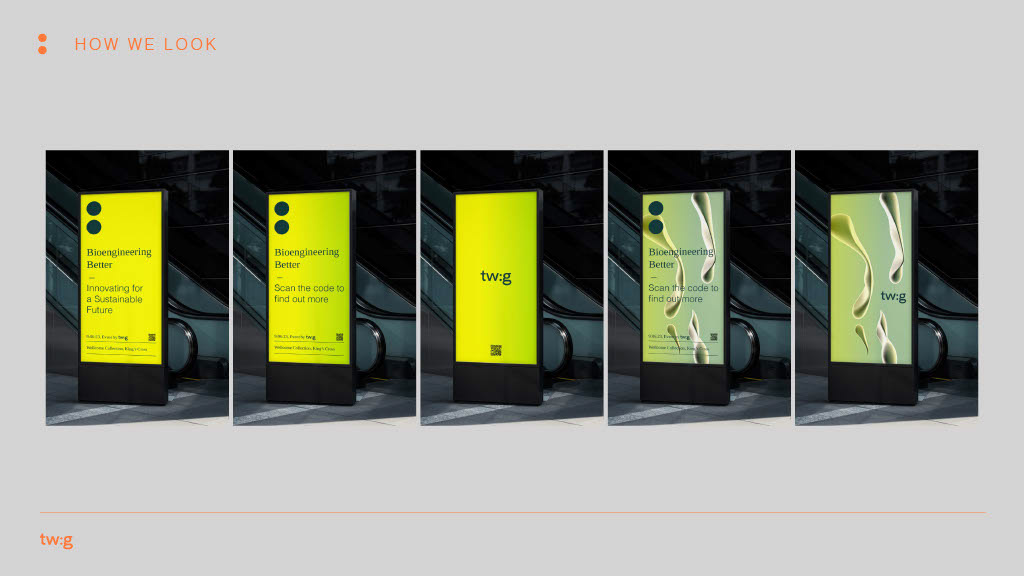
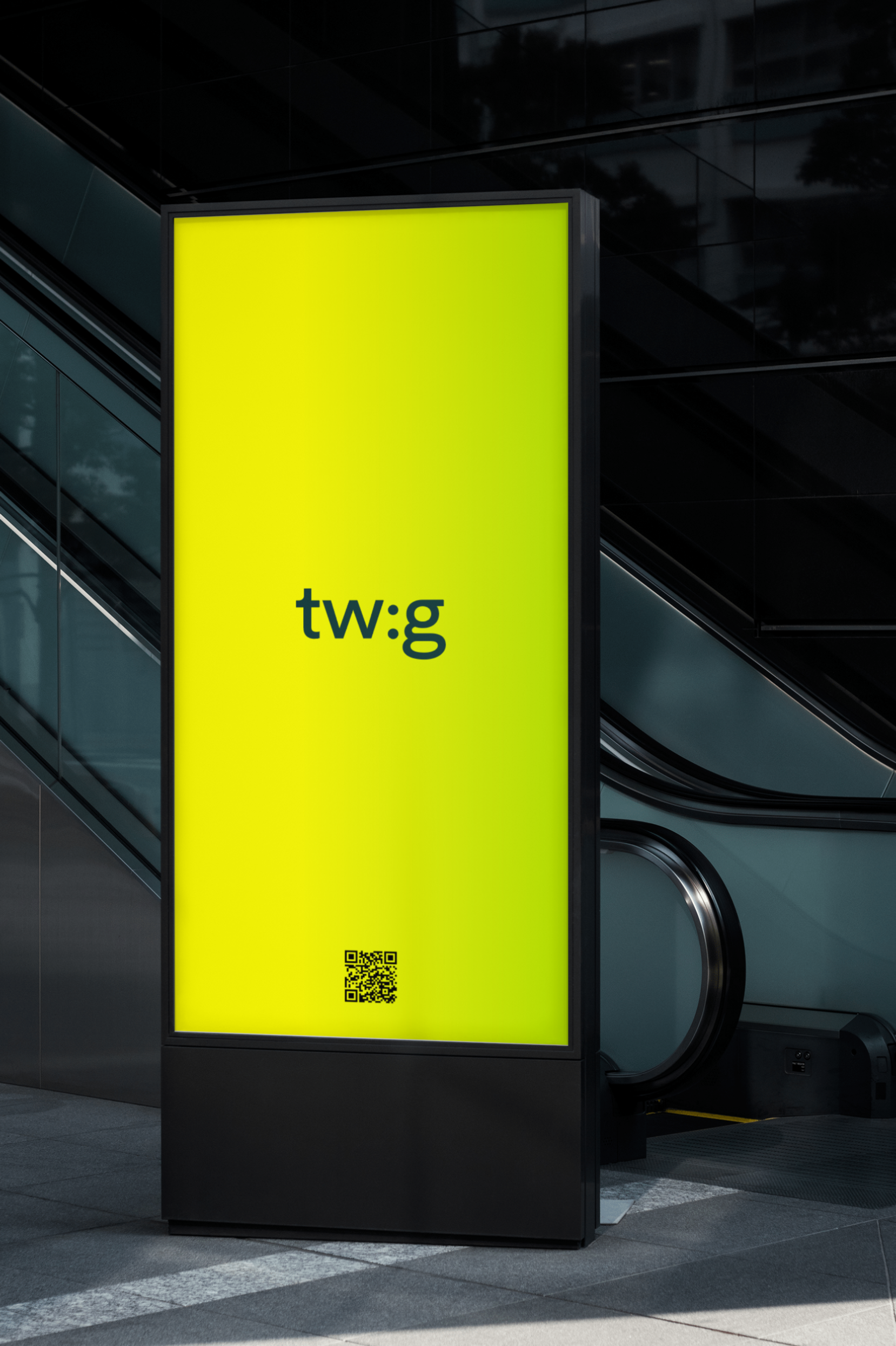
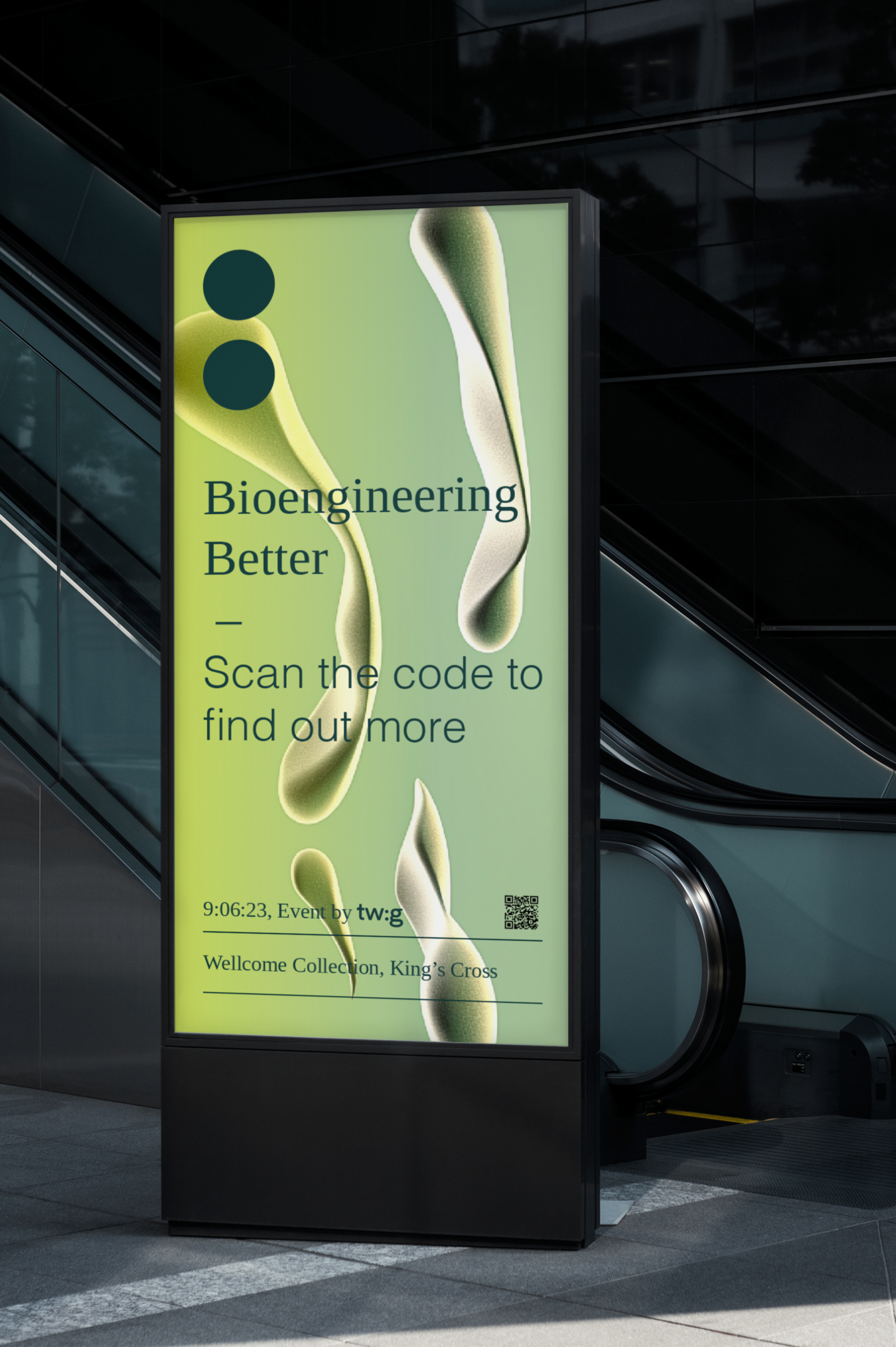
The brand’s key motif became the colon (:) drawn from twig’s AI-led strain identifier system. This becomes more than punctuation: it’s a visual signal of “something to follow,” of future potential, growth and transformation. The colon implies continuation: the promise of something better to come.
3. Harmonising structure, creativity and tone
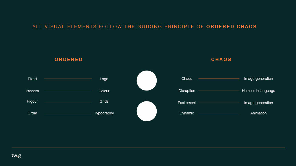
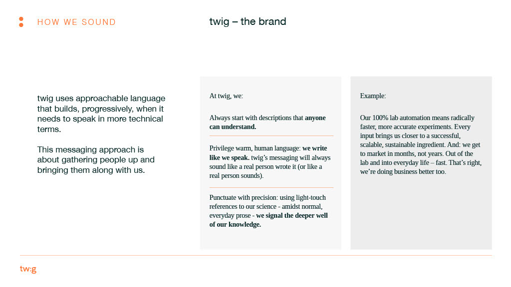
We merged rigorous design systems with creative AI-generated imagery and human-centred language. This meant building:
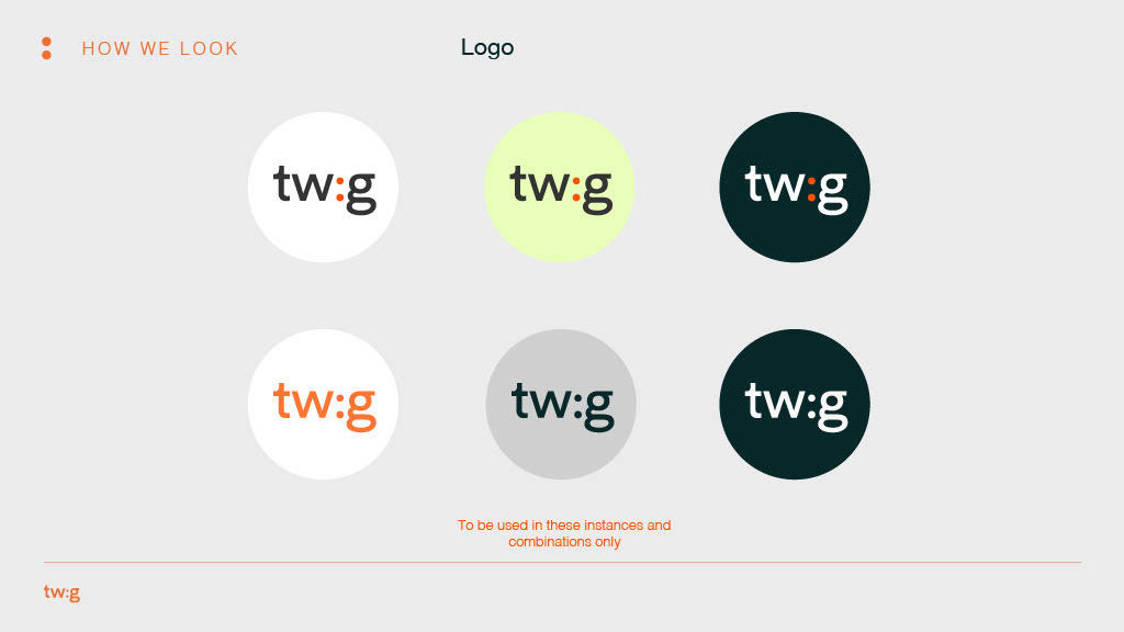
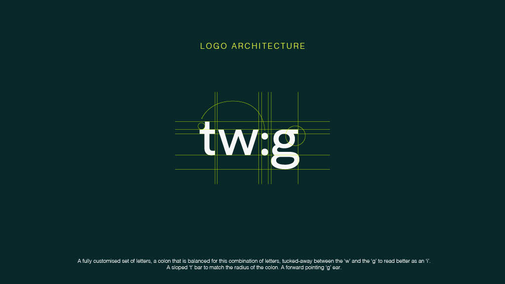
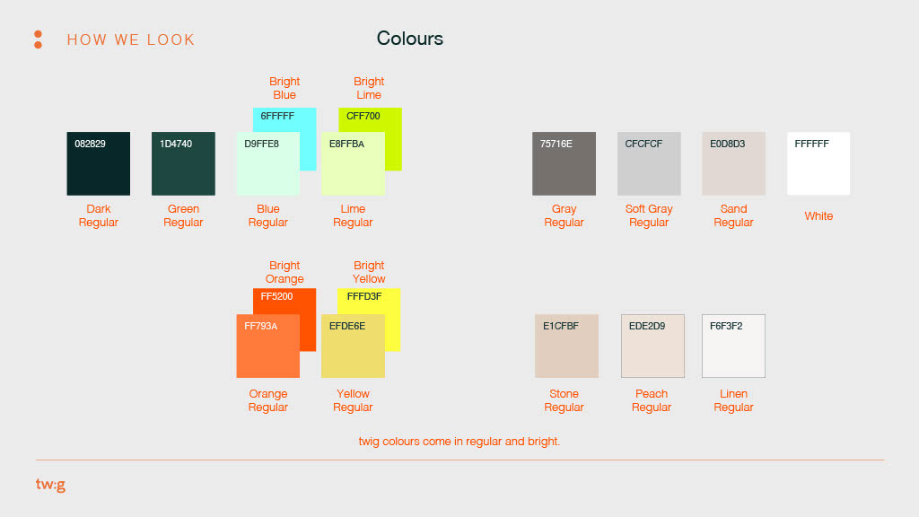
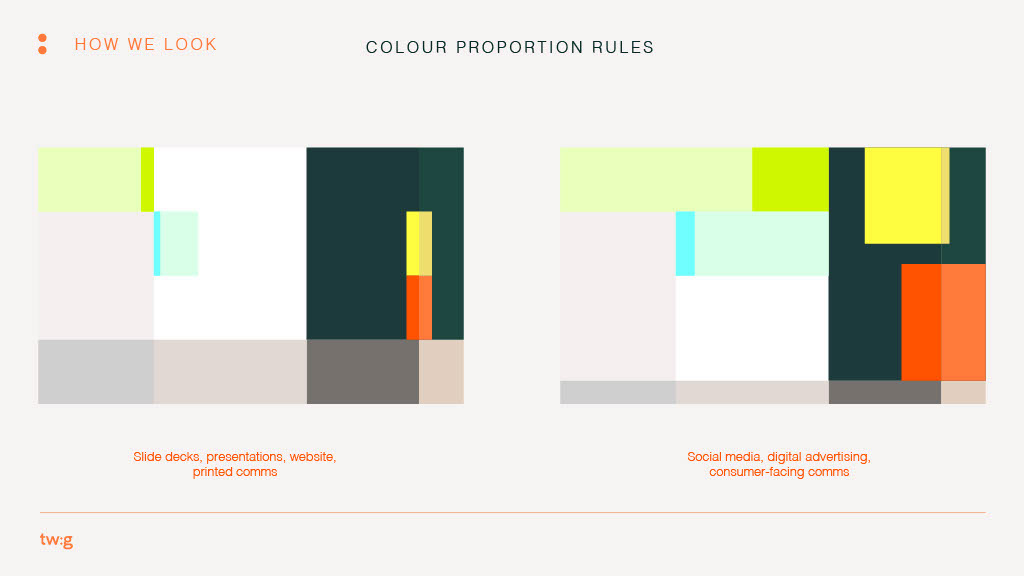
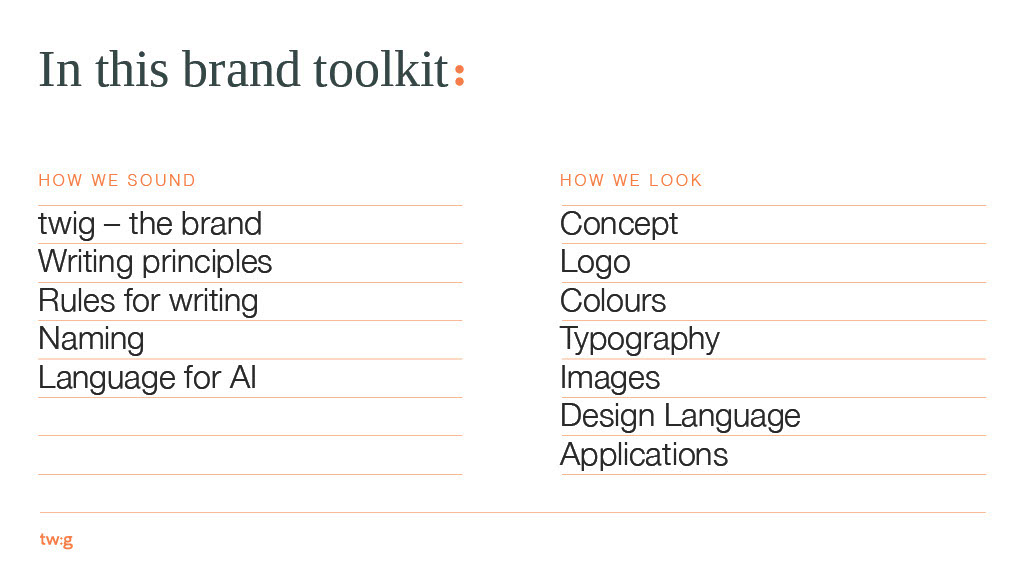
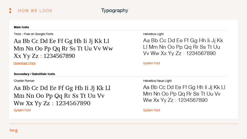
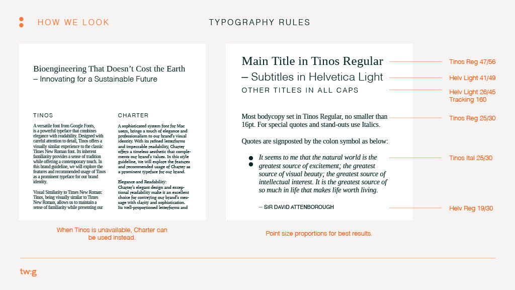
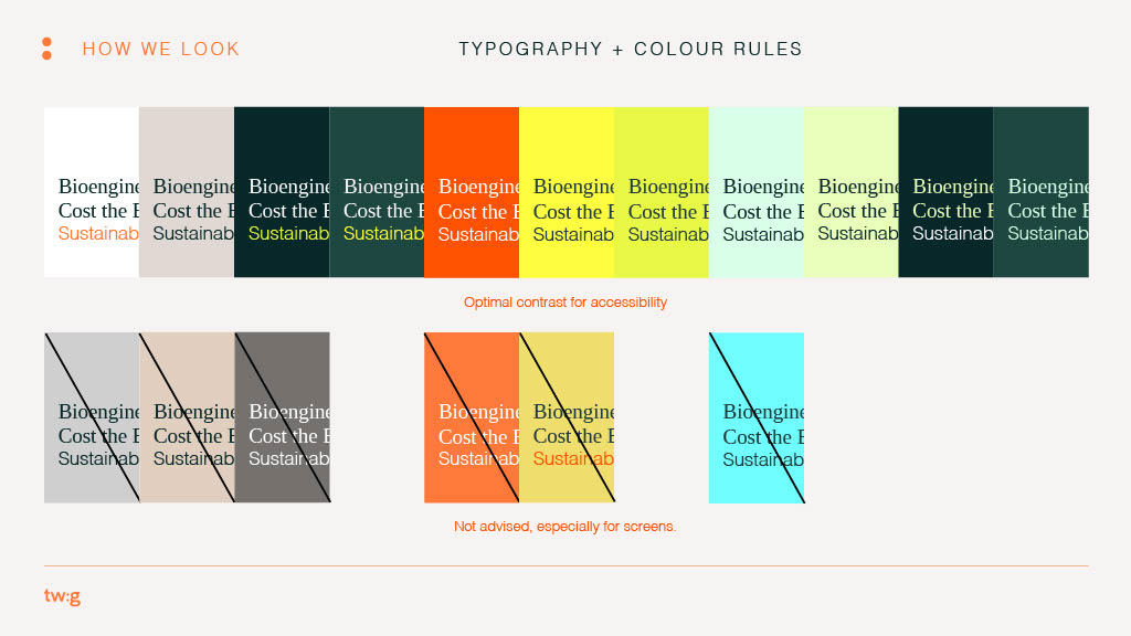
- a comprehensive brand toolkit (logo, typography, colour, iconography)
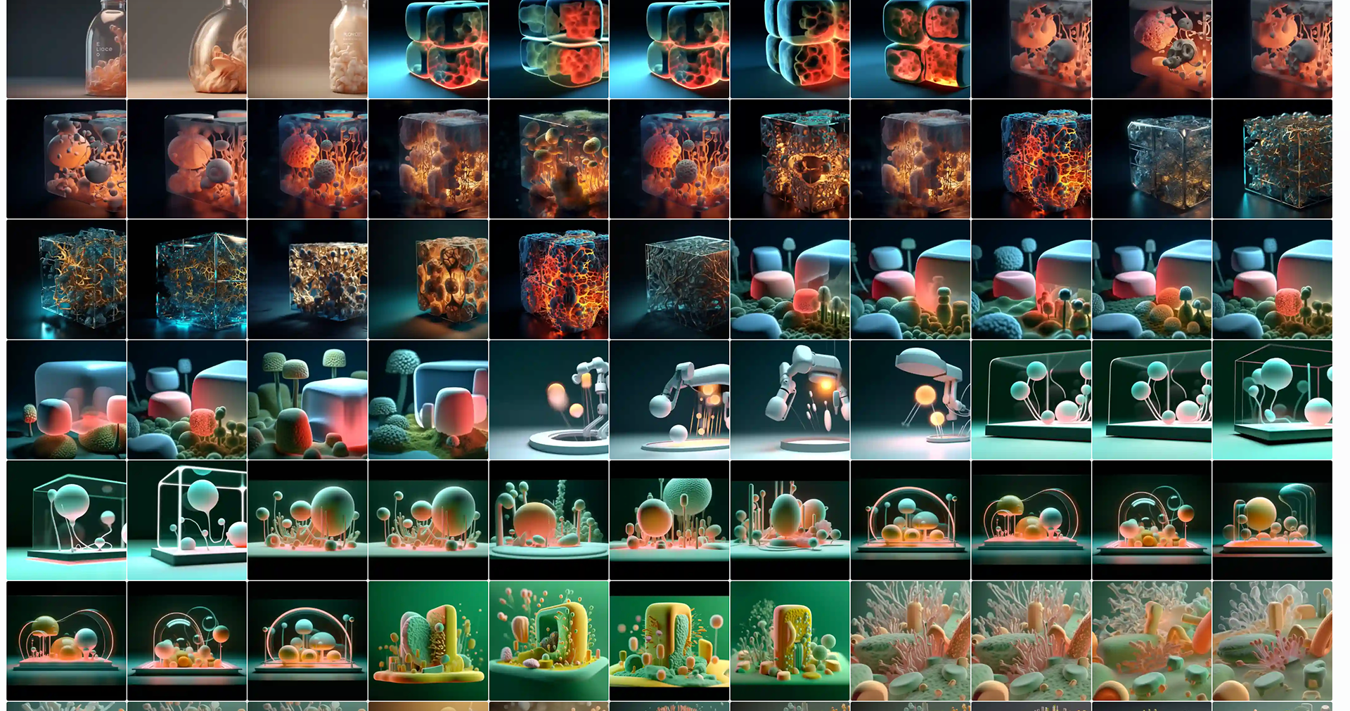
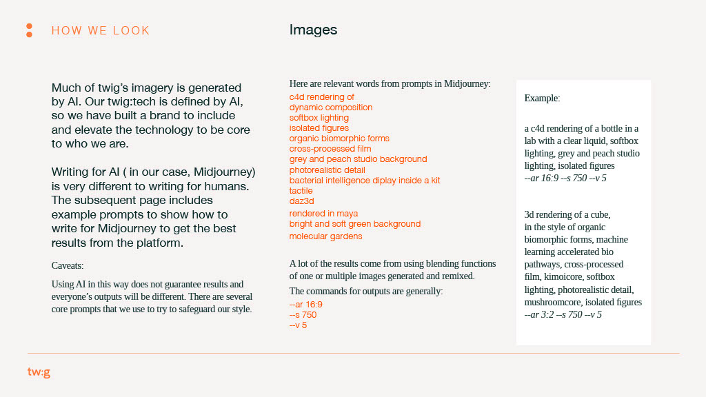
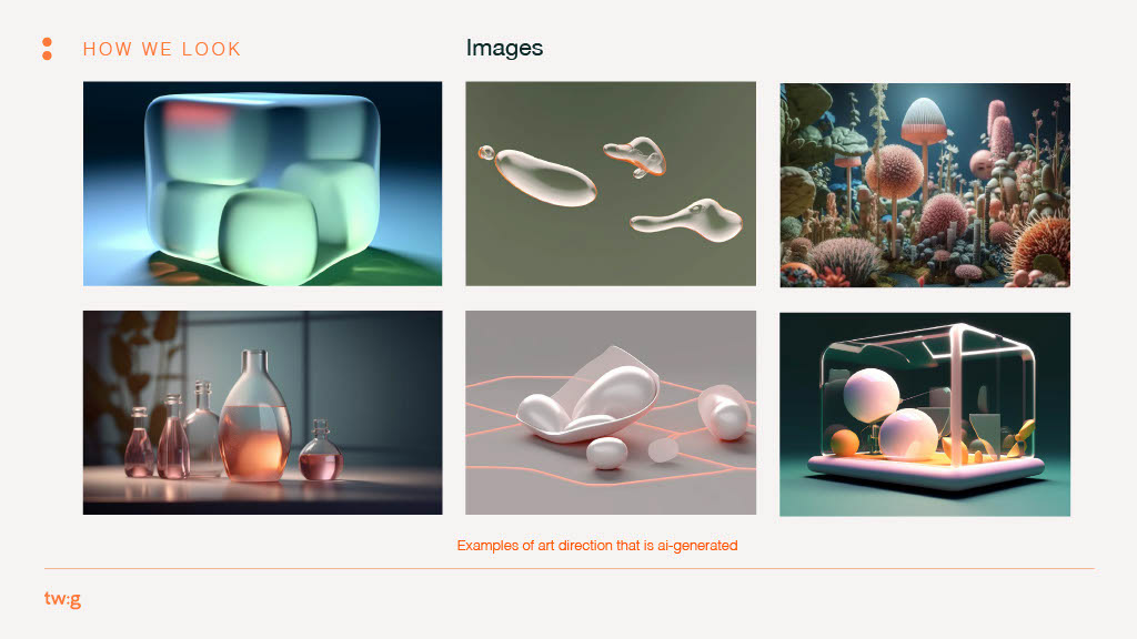
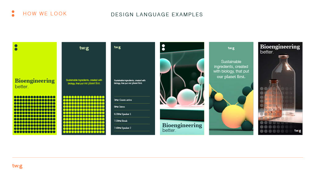
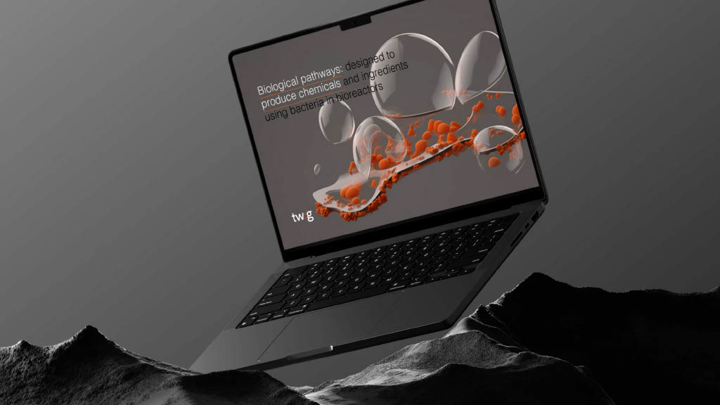
- guidelines for AI-generated imagery
- motion-ready assets and animation library
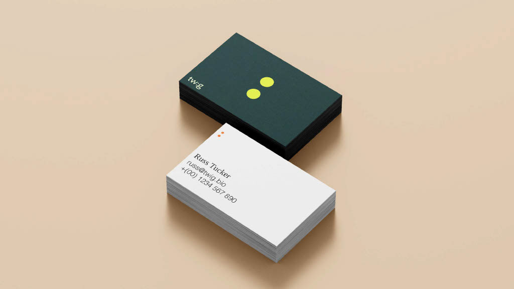
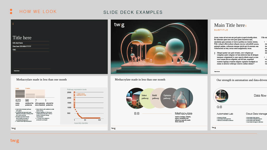
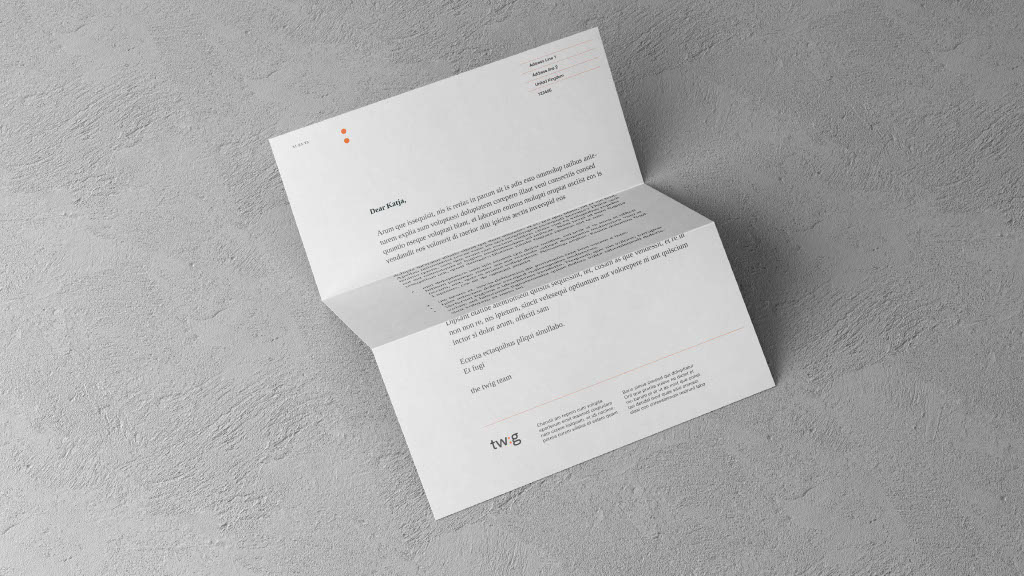
- stationery, pitch decks, business cards, media templates
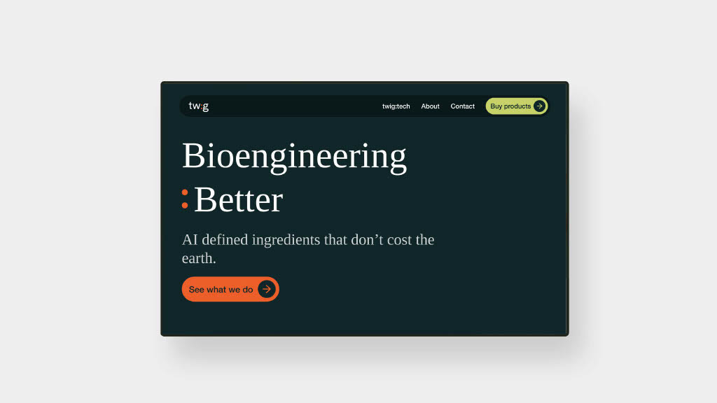
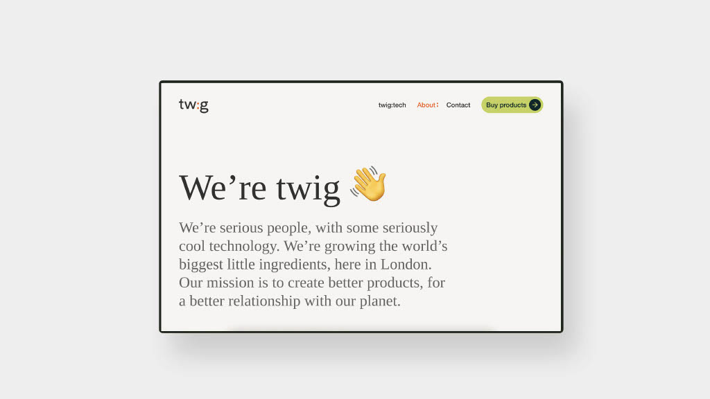
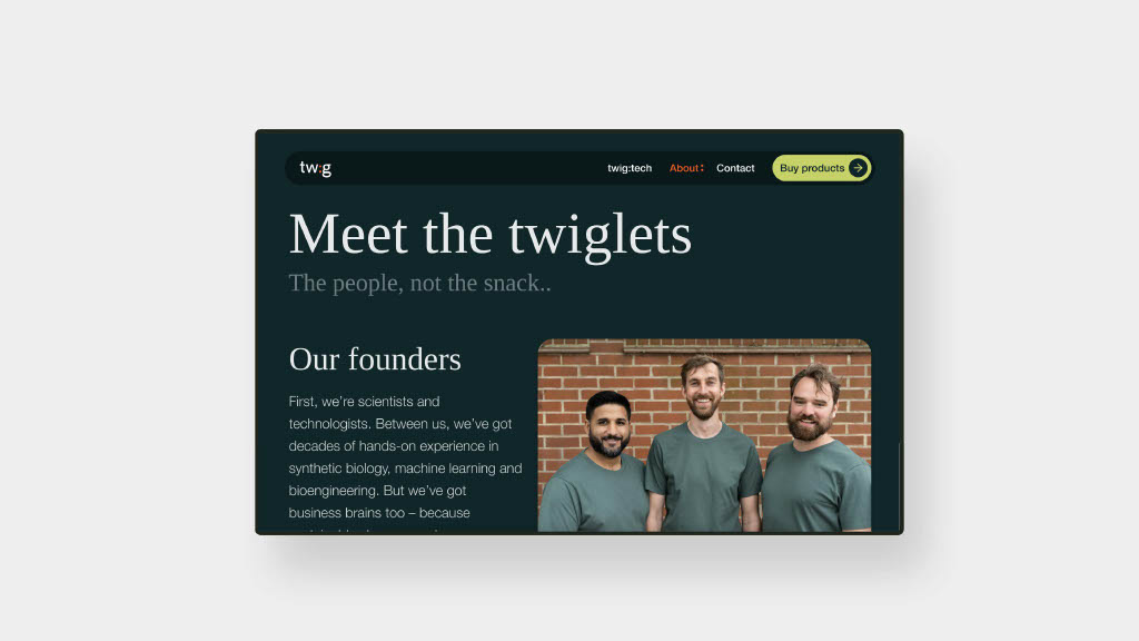
- responsive layout and web UI/UX that blends science content with an accessible presentation
4. Empowering internal ownership
Knowing twig would scale, we created templates and style guidelines so their internal team could self-produce future materials while staying on brand.
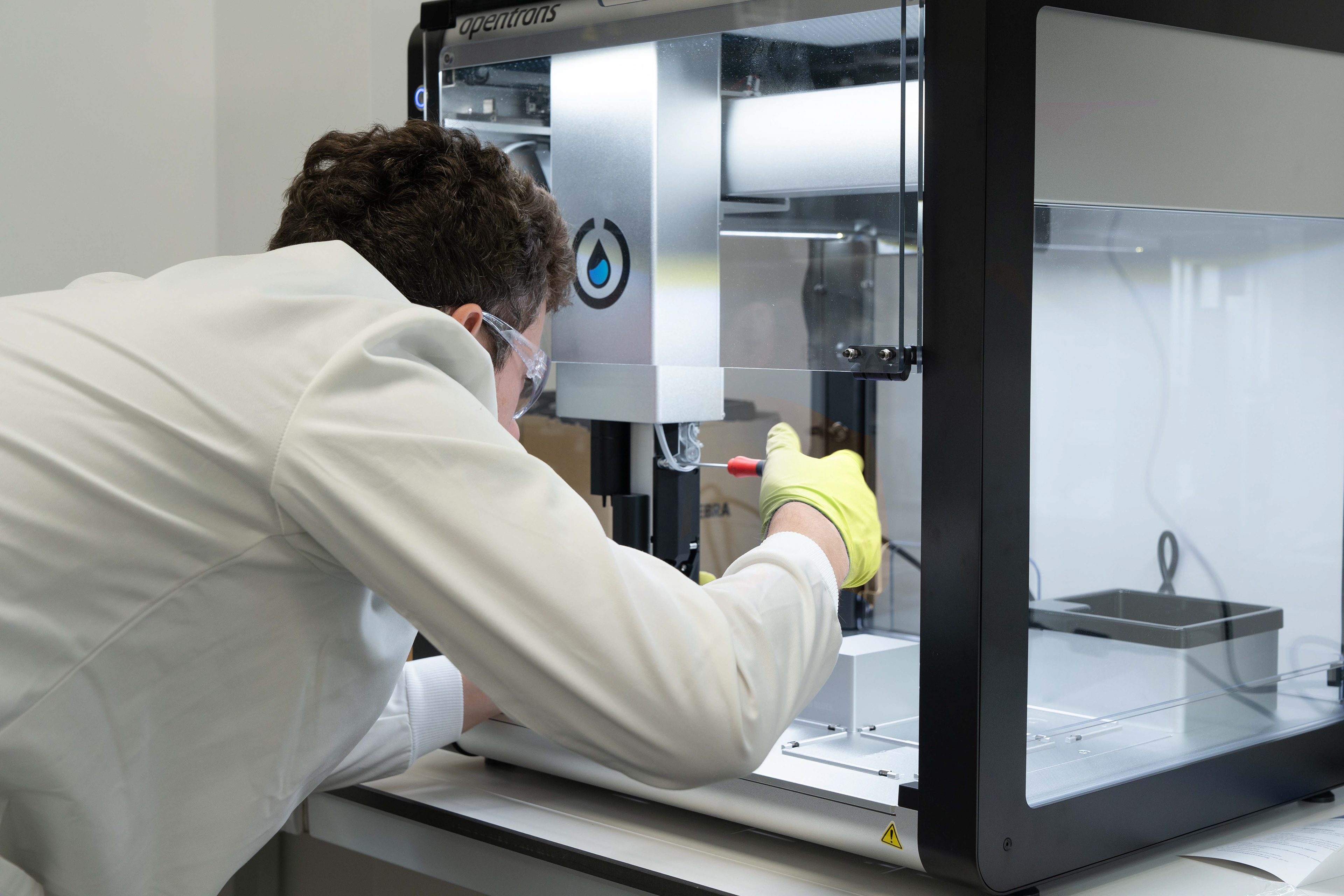
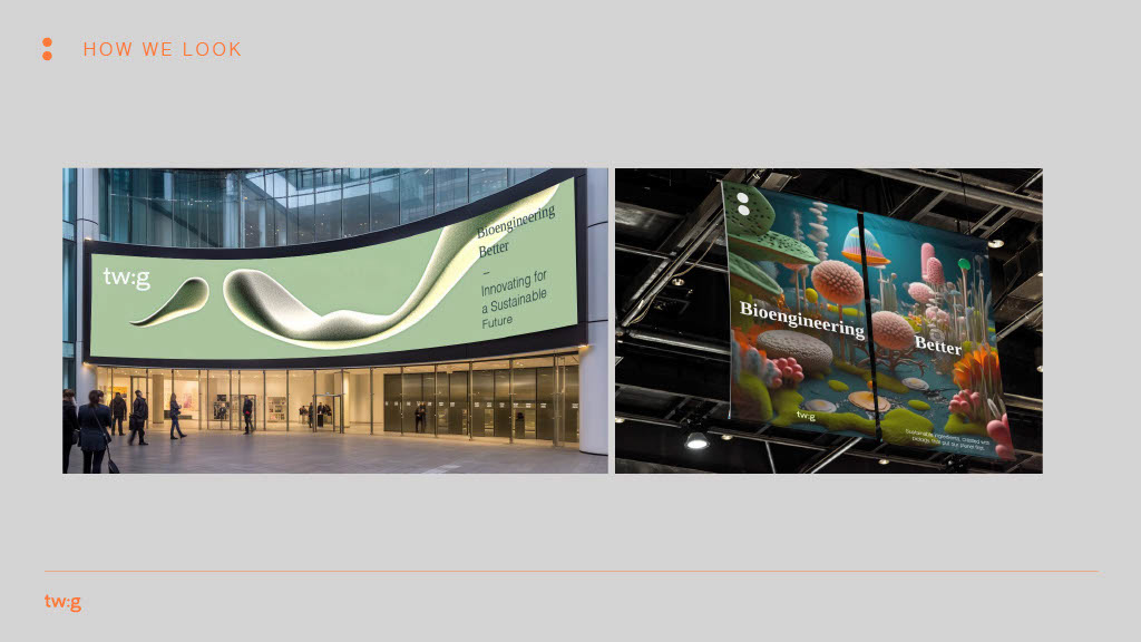
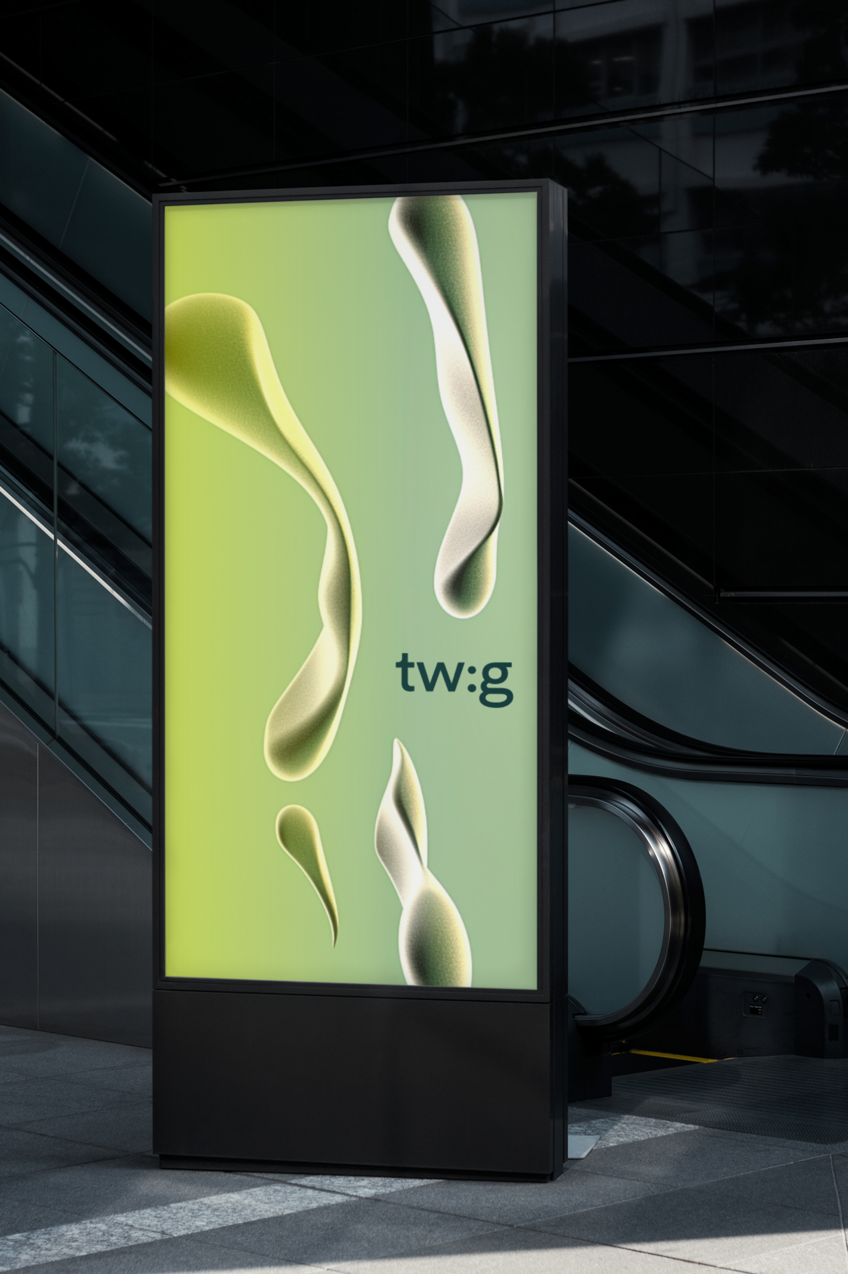
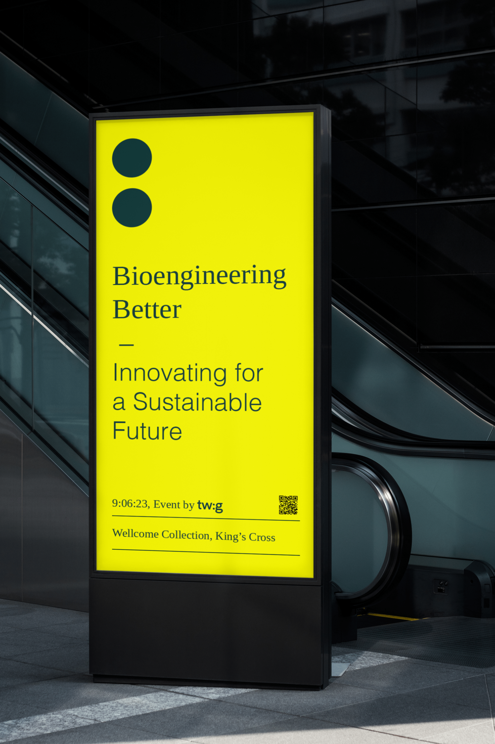
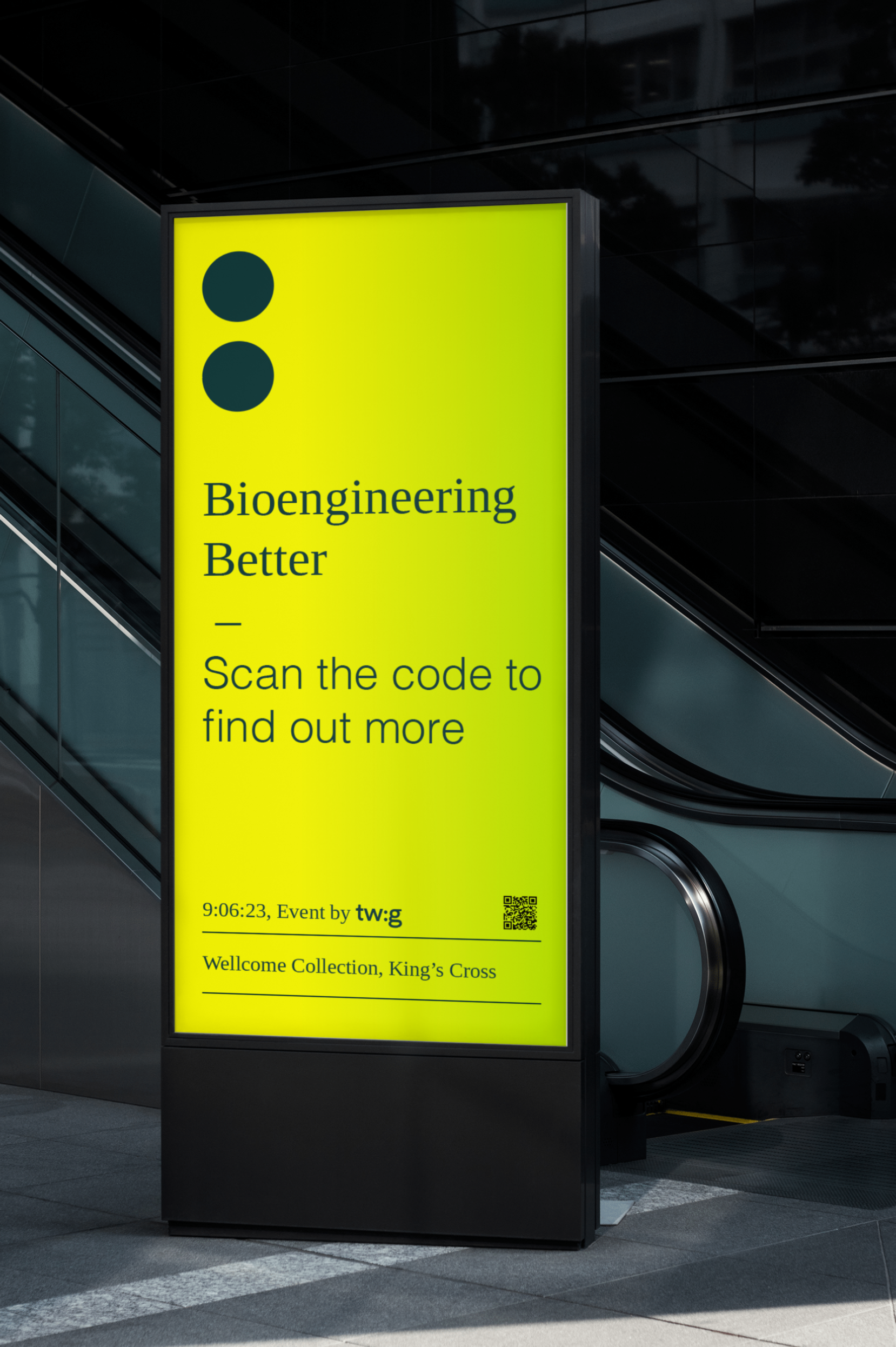
Initial Exploration, Typography and Moodboards
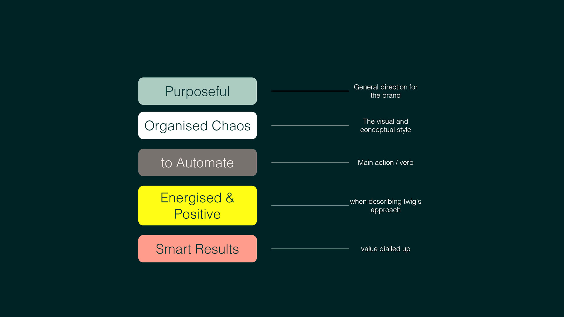
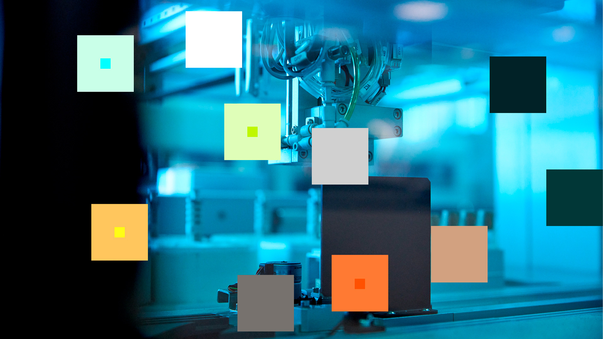
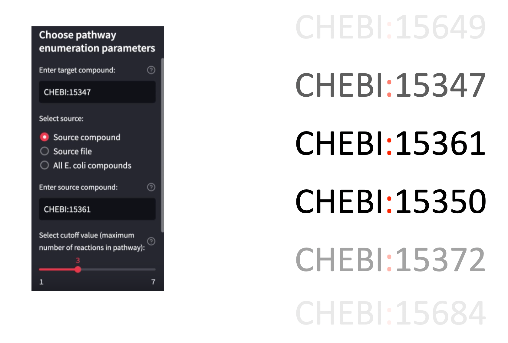
Brand DNA and Graphic Language
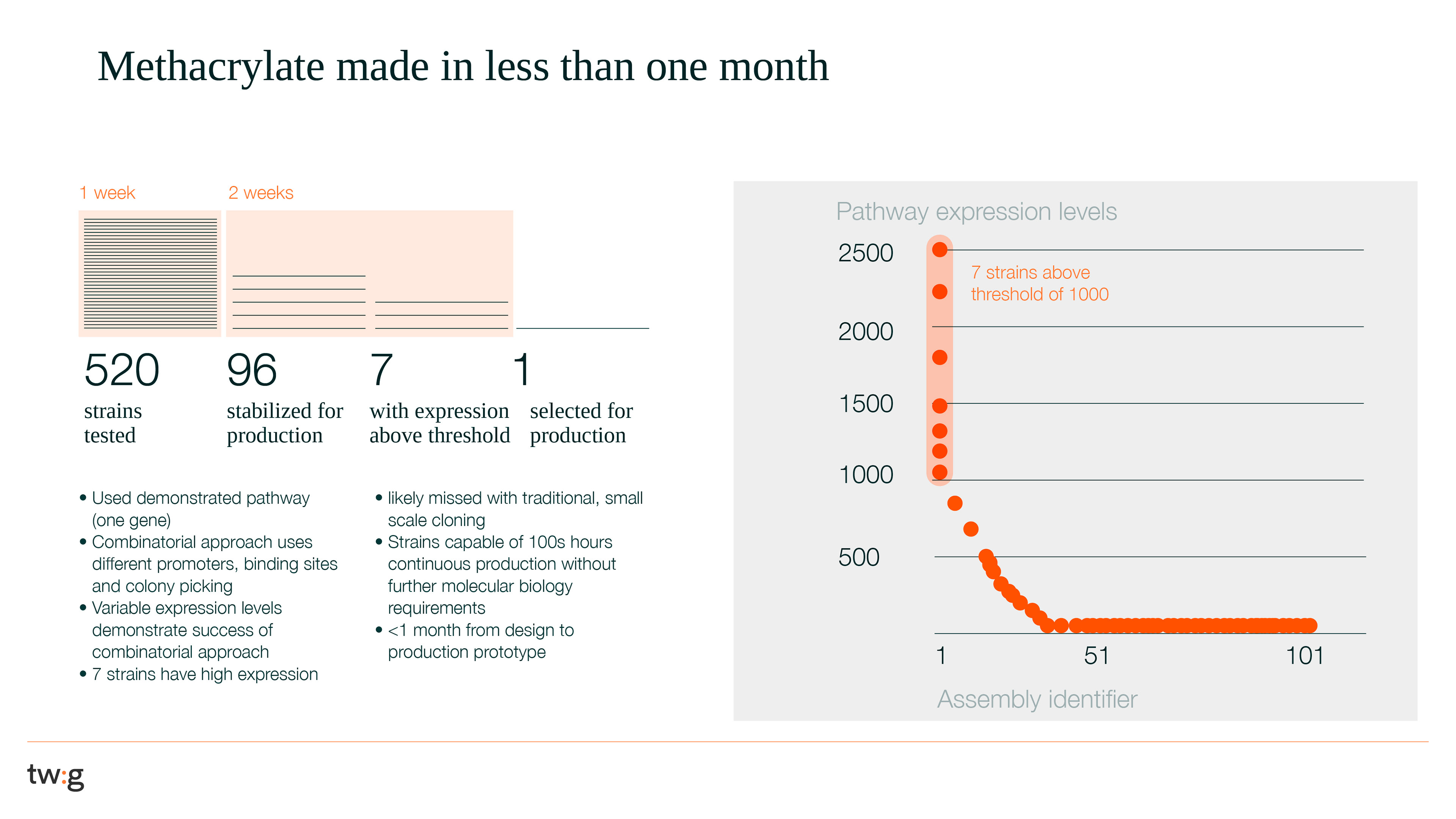
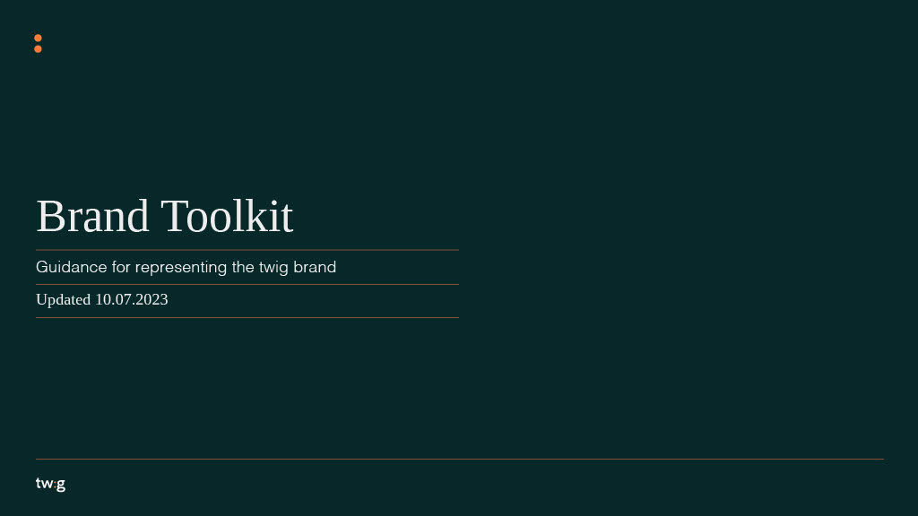
Full Brand Guidelines
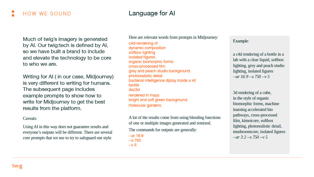

Deliverables
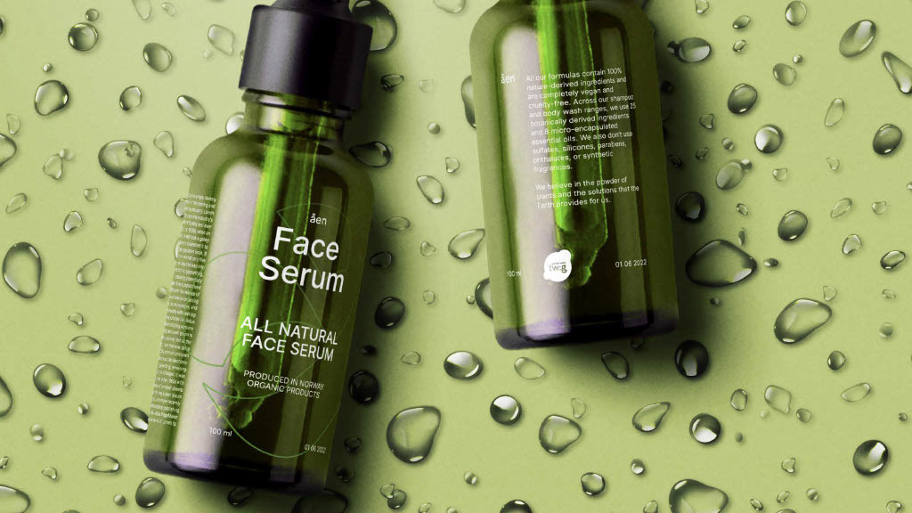
Full Brand Toolkit including visual identity, tone of voice, AI-image generation guidelines, iconography, stationery, asset libraries
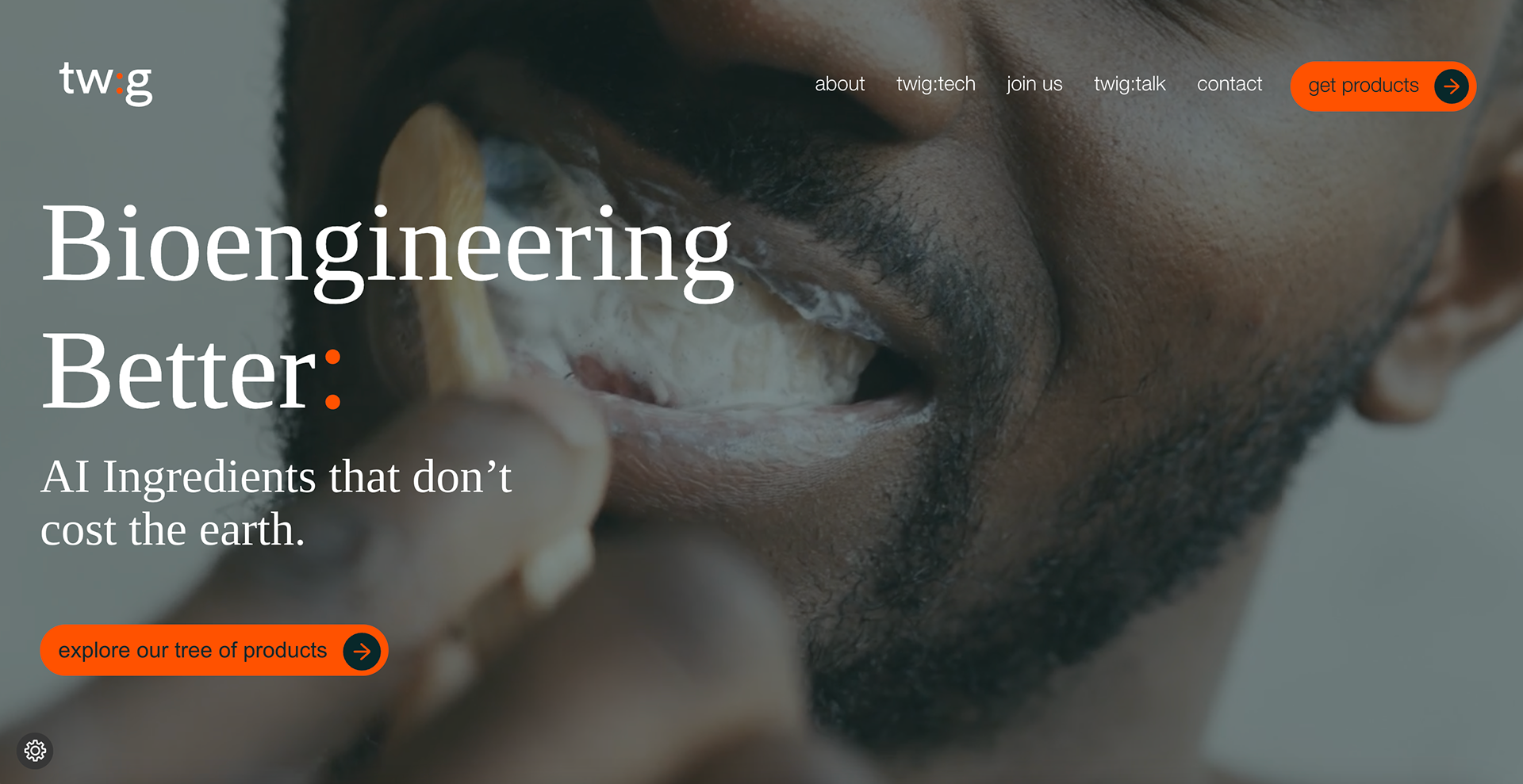
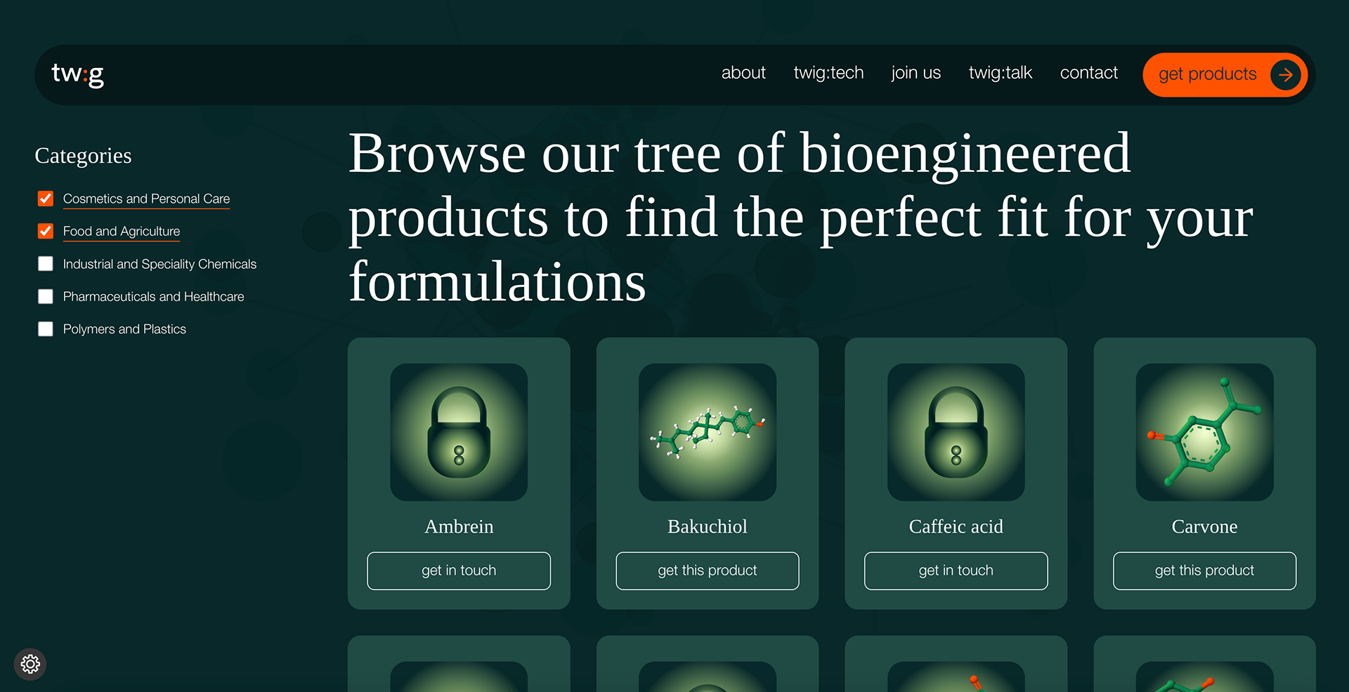
Web UI/UX & Kit Art Direction: website brief to balance technical depth and approachable narrative; the brand’s personality comes through colour, type, motion, and layout
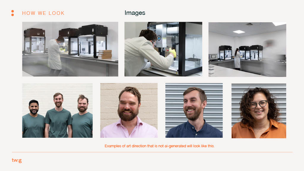
Creative & Motion Assets: video, animated elements, photography-style imagery (AI-assisted), all aligned under the new visual system
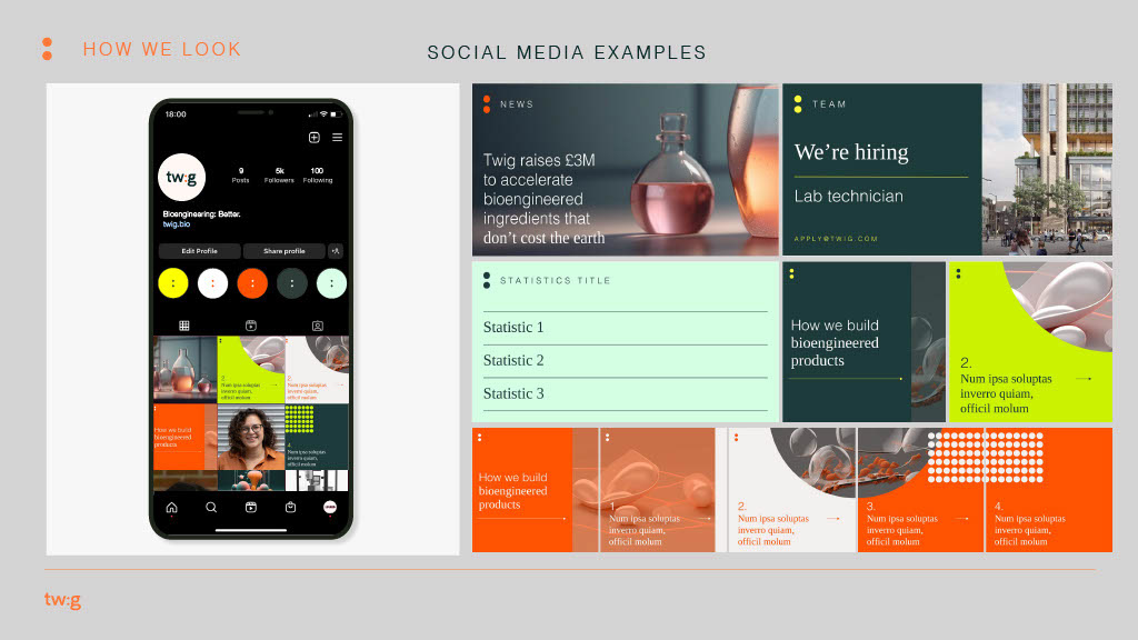
Launch & Scale Materials: pitch deck, social/launch imagery, templated communication assets, social identity kit
Role
As sole Designer & Art Director at Cohesion Labs, I:
Led the creative conceptualisation and visual identity design
Defined the core trademark motif (colon) and visual language
Oversaw UI/UX and web build alongside strategists, motion designers and copywriters
Delivered a full brand toolkit and scalable systems for internal brand ownership
Defined the core trademark motif (colon) and visual language
Oversaw UI/UX and web build alongside strategists, motion designers and copywriters
Delivered a full brand toolkit and scalable systems for internal brand ownership
